What Is a Brand Guideline
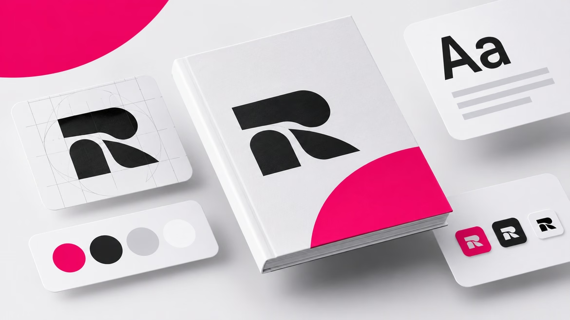

A brand guideline (or style guide) is a document with rules for using brand identity elements, plus examples of correct and prohibited applications. It explains how to design a banner, a social media post, a business card, or a UI component so the brand looks consistent—no matter who creates the material: an in-house designer, an agency, or a freelance contractor. If a brandbook answers «what is the brand’s style?», a guideline answers «how to use this style.» The difference is critical: without the first, there’s no identity; without the second, the identity falls apart by the third layout.
Brandbook vs. Guideline vs. Logobook: What’s the Difference?
- Brandbook — a comprehensive document about the brand overall: mission, values, positioning, audience, platform, visual style, and tone of voice. In a classic setup, the brandbook is partially confidential: positioning and strategic insights are commercial information with restricted access.
- Guideline — the public part of the brandbook, a technical handbook for the visual style. It’s shared with employees, contractors, partners, and franchisees without restrictions.
- Logobook — a narrow document focused only on the logo: versions, safe zone, minimum sizes, and prohibited scenarios.
The hierarchy is simple: the logobook is part of the guideline; the guideline is part of the brandbook. In practice, names are often mixed up: clients call any style document a “brandbook.” To avoid misunderstandings, the scope should be fixed in the brief: this prevents situations where one side expects full brand research and the other delivers a PDF with a color palette.
There’s also a separate category: interface guideline — rules for building websites or mobile apps. It serves the same purpose as a print guideline but includes a UI kit (a library of interface components) and usage principles for them. Digital products usually exist within a brand’s ecosystem: they don’t get their own brandbook, but a guideline is mandatory. An example is “Kontur.Guides,” which include program principles, user research results, a component library, and rules for using those components.
Why You Need a Brand Guideline
- Consistency across all touchpoints. Ads, packaging, website, social media, office signage — all follow the same system. Consistency builds recognition and trust: audiences perceive scattered styling as disorganization, while a steady look signals reliability.
- Resource savings. Designers don’t reinvent font sizes, spacing, and color combinations every time — the rules are already documented. This reduces revisions and approvals and speeds up production. For digital products, it’s even more efficient: developers can adjust component size, color, and animation on their own, while UX designers focus on user flows and new features.
- Managed work with contractors. A guideline replaces lengthy explanations for every order. External executors get a single document with all requirements, so quality doesn’t depend on who attended the kick‑off call.
- Support for franchising. A network keeps a unified look across regions and countries — from signage to uniforms — without micromanaging every location.
- Safety net during rebranding. The guideline preserves the core concept and lets you update the style gradually without losing existing recognition.
- Value communication. Appearance is the first thing people notice. Green in food services suggests natural ingredients; strict geometry in finance signals reliability. The guideline locks these associations into rules, not just intuition.
Guideline Structure
Core Elements (Required for Any Guideline)
- Logo. Appearance, print versions (color and single‑color), minimum sizes, simplified variants, safe zone (minimum distance from the logo to other elements). Include examples of prohibited uses: the logo must not be distorted, cropped, rotated, arbitrarily recolored, or pressed against the edge of the layout.
- Color palette. Primary and accent shades in HEX, RGB, CMYK, and Pantone. HEX and RGB for digital; CMYK and Pantone for print. It’s important to note that print colors vary by printing capabilities, so the guideline should define acceptable ranges rather than a single “perfect” shade.
- Typography. Main and secondary fonts, weights, sizes, line height, kerning, and tracking, plus usage rules for each material type. Digital materials use web fonts that load with the interface; email newsletters use simplified versions from a basic font set because email clients support a limited range of typefaces.
- Backgrounds and decorative graphics. Patterns, illustrations, icons, photos. Rules: backgrounds must not interfere with text readability or logo visibility; icons should be simple, single‑color, and aligned with the brand character. Include ready‑made icon packs.
- Grid systems. A layout structure dividing the space into areas. For print: grids for A0–A4 formats, billboards, and signage; for digital: website and app grids with spacing rules for different screen resolutions.
- Photo style. Shooting and editing rules: lighting, composition, color correction, mood boards. This section protects the brand from random stock photos.
- Layout rules for carriers. Element arrangement on banners, business cards, flyers: positioning, proportions, spacing. For example, the logo is placed only in the top left with a specific margin — vague phrases like “in the spirit of the brand” don’t work in guidelines; millimeters and pixels do.
Sections for Digital Products
- Components. Names, sizes, design, interaction states (default and others), keyboard support, animation presence. A good example is “Kontur.Guides,” where each component has a visual sample and detailed instructions.
- Prohibited combinations. A separate block listing unacceptable element combinations, like in the “Gosuslugi” guideline.
- Screen templates. Structure of screens: header, content area, footer. Separate templates for support pages, error pages, welcome screens, and emails. Define backgrounds, colors, light and dark modes.
- Animation. Transition behavior between screens and animations within elements, speed, and type depending on screen hierarchy. For example, “Kontur’s” guideline defines what “slow” and “fast” response times mean and includes rules for preloading pages.
- Responsive design. Layout composition for desktop, tablet, and mobile: mockups, component sizes at different widths, grouping rules. “Rostelecom” specifies grid behavior for each resolution.
- User scenarios. For complex interfaces, a simplified Customer Journey Map (CJM) with key interaction steps.
Large companies go further and build design systems: a UI kit, page templates, guideline, frameworks, and component code in one ecosystem.
Additional Sections
Big brands include non‑visual parameters: sound rules, material properties, even scents — for example, a jewelry brand may specify how stores should smell and what kind of fabric bags to use for packaging. Other additions: interiors and exteriors (signs, navigation, mounting), documentation and emails, ad layouts with regulatory standards, merch, merchandising, and employee uniforms with rules for badges and patches.
Principles for Creating a Guideline
- Simplicity. Structure and wording must be clear to all team members, including those who haven’t read the brand platform. Use plain language, diagrams, and tables instead of long texts.
- Visual clarity. Show both correct and incorrect examples for each rule. Ambiguous rules lead to layout errors, so “show, don’t tell” is a practical principle.
- Detail. Provide technical parameters and units: millimeters, points, pixels. Phrases like “sufficiently large logo” aren’t verifiable and therefore aren’t rules.
- Flexibility. The guideline gives general recommendations and boundaries but shouldn’t stifle creativity. A document with a rule for every pixel won’t survive real‑world use.
- Alignment and uniqueness. Rules should reflect the brand’s character and values, while original elements make the identity distinctive. Copying elements from other brands can lead to trademark registration issues.
How to Create a Guideline: Step‑by‑Step
- Define the goal and audience. Who will use the document: in‑house staff, a rebranding agency, franchisees, or a printing house? This determines the depth of each section.
- Do research. Review design guides, best practices, industry standards, and reference guidelines from similar brands — as sources of ideas, not copies.
- Study the brand. Understand its history, mission, values, audience, competitors, and market. Without this, the guideline becomes a random set of rules; with it, it becomes a tool for expressing the brand’s character.
- Draft the structure. Organize sections and subsections around the core elements listed above; for digital, add an interface rules section.
- Write the recommendations. Keep them short, clear, and supported by examples and illustrations for every rule. Avoid jargon and complex terms.
- Test the document. Share it with the client and colleagues, check for accuracy, completeness, and consistency, collect feedback, and revise.
- Proofread and format. Check spelling and inaccuracies yourself or with an editor. Format options: PDF, web resource, or interactive app. The main criteria are accessibility and the ability to update it over time.
Common Mistakes
- Treating the guideline as a showcase, not a tool. A beautiful PDF that’s opened once isn’t useful. A simple check: if contractors don’t refer to it during work, it isn’t working.
- Missing “do not” examples. Without anti‑examples, people interpret rules their own way. A “this is not allowed” column saves hours of revisions.
- Rules without units. “Enough spacing” isn’t a rule.
- Ignoring print constraints. A palette without CMYK and Pantone references turns every print job into negotiations with the printer.
- No updates. Guidelines are living documents: new carriers, components, and formats must be added as they appear; otherwise, the brand ends up operating outside its own rules.
- Overly rigid rules. A pixel‑by‑pixel manual kills flexibility and team motivation
FAQ
Are a guideline and a brandbook the same thing?
No. A brandbook describes the brand as a whole: mission, values, positioning, and style. A guideline is a part of the brandbook — a technical handbook for applying visual elements. A logobook is an even narrower document focused only on the logo.
What’s the difference between a guideline and a logobook?
A logobook fixes logo versions, safe zones, minimum sizes, and prohibited scenarios. A guideline covers the entire visual identity: palette, typography, graphics, grids, photo style, and carriers.
How does an interface guideline differ in content?
It includes a UI kit (component library), screen templates, animation rules, responsive layout, and user scenarios. It doesn’t cover print carriers, but inherits logo and palette rules from the brand’s main guideline.
How many pages should a guideline have?
Length depends on the goals, not on a fixed norm. A startup may need only 15–30 pages with core constants; a large brand with franchises and digital products may need hundreds of pages or a full design system.
Who should receive the guideline?
Employees, contractors, agencies, franchisees, printing houses, and collaboration partners. The guideline is the public part of the brandbook and shouldn’t be restricted.
Does a small business need a guideline?
Yes, at least in a minimal form: logo versions, palette with CMYK codes, a couple of fonts, and combination rules. It’s cheaper than redesigning a chaotic visual style later.
 Iteration
 Color Wheel
 Lettering