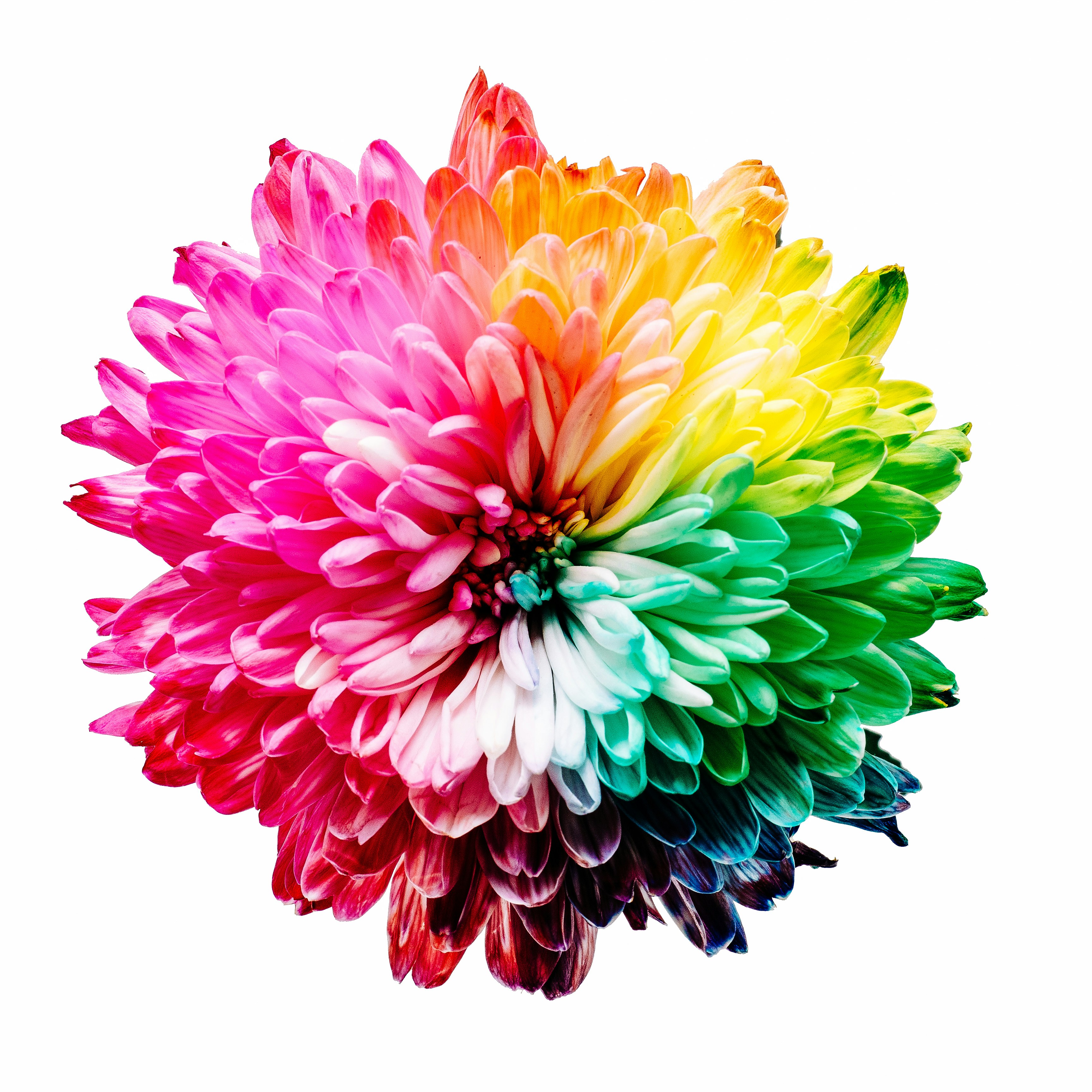
Color Wheel


Designer Alex received an order to create a logo for a new café in the city center. The owner wanted something “modern but cozy.” Alex made several sketches: clean lines, stylish typography, but something was clearly missing. The mockups looked too cold and impersonal. Then he remembered an old tool — the Itten color wheel. By selecting a palette based on an analogous scheme — soft shades of green with an accent of warm yellow — he achieved harmony. The logo immediately “came to life,” and the client said, “Now, this is our café!”
This case showed Alex that color is not just decoration but a language through which a brand speaks to its audience. And to make this language convincing, a time-tested tool is needed — the color wheel.
What Is a Color Wheel
A color wheel is a scheme in which colors are arranged in a specific sequence that reflects their relationships. Its modern version traces back to the work of Swiss artist and theorist Johannes Itten, who, in the early 20th century, systematized knowledge about color and proposed a visual model for artists and designers.
At the center of this model are three basic elements. Primary colors — red, blue, and yellow. Secondary colors — green, orange, and purple, created by mixing the primaries. And finally, tertiary colors — shades that arise from mixing primary and secondary colors.
In addition, the color wheel accounts for characteristics such as hue, saturation, and brightness. These allow for an infinite number of combinations, adapting the palette to the mood, task, and audience.
Key Color Schemes for Creating Harmony
Complementary Scheme
Complementary colors are positioned opposite each other on the wheel: for example, red and green, or blue and orange. Their combination creates strong contrast and an energetic mood. In branding, this scheme is often used for accents. The FedEx logo, where purple combines with orange, is a successful example.
Analogous Scheme
Analogous combinations are built on neighboring colors: green, blue, and turquoise. They create smooth transitions and a sense of calm. This approach suits brands connected to nature, care, or eco-friendliness. For example, cosmetics brands working with natural ingredients often use analogous palettes.
Triadic Scheme
The triadic scheme is based on three equally spaced points on the wheel. A classic example is red, blue, and yellow. These combinations are dynamic, but when applied thoughtfully, they create balance. Triadic palettes are often used in sports brands, where energy and movement are important.
Tetradic (Rectangular) Scheme
This uses four colors forming a rectangle. Such a palette is more complex to apply but opens vast creative possibilities. It suits brands with a wide product range that want to showcase diversity.
Split-Complementary Scheme
This is a softer contrast variant: the main color is combined not with its opposite but with its neighbors. The result is moderate expressiveness without aggressiveness. Brands focused on friendly and open communication often use this method.
How to Use the Color Wheel in Branding
Choosing a Palette for a Logo
A logo color is the first thing a client sees. It should reflect the brand’s values and character. Red is associated with energy and passion, blue — with reliability and technology, green — with nature and health. Using the color wheel, accent shades can be selected to emphasize the core idea and make the logo more expressive.
Developing Brand Identity
A brand’s identity is built not only on a logo but on a whole color system. Primary, secondary, and accent colors must harmonize and work across all media: from business cards to packaging and websites. The color wheel helps create these combinations so the brand remains recognizable and harmonious in any context.
Application in Marketing
Color affects the perception of advertising materials, banners, and social media posts. Harmonious palettes build trust and help convey emotion. For example, premium brands use deep, rich shades, while tech startups opt for bright and dynamic colors.
The Role of Neural Networks in Working with Color
In 2025, designers increasingly have tools that once seemed futuristic. Neural networks can analyze target audiences, consider trends, and generate harmonious palettes according to specified parameters.
The color scheme generation tool by Nikolai Ironov is a good example.


Ironov can suggest logo combinations that match a brand’s mood — for instance, an “energetic startup” or an “eco-friendly service.” Neural networks also help check how a palette will look in different formats — on clothing items, apps, or packaging.
Creating logos with artificial intelligence has become not just a trendy tool but a practical approach. Modern algorithms respect the laws of color harmony and allow dozens of variations to be tested quickly.
Color Trends of 2025
The new year brings new visual accents. Designers highlight several directions that will define brand palettes:
- Soft pastel gradients, creating a sense of calm and trust.
- Natural “earth” shades — from sand to olive — emphasizing the value of nature.
- Bright neon accents, adding energy and helping brands stand out digitally.
- Monochrome palettes, symbolizing minimalism and premium quality.
Each of these trends can be easily interpreted through the color wheel, making the tool timelessly relevant.
Conclusion
When Alex’s café opened, visitors immediately noticed that the interior and logo created a special atmosphere. People returned not just for coffee but for a sense of comfort and harmony. The owner said, “Our brand is now recognized by its colors.”
The color wheel helped make conscious choices and turn an idea into a visual identity. This proves that working with color is not random or “designer intuition,” but a clear system that helps a brand be visible, harmonious, and memorable.
And in 2025, when consumer attention is increasingly scattered, color remains the anchor that keeps a brand in memory.


