The Psychology of Color

An artist Lena opened a small design studio. At first, her clients came through acquaintances, and she completed projects diligently. But competition kept growing. She noticed that some companies with simpler solutions managed to capture attention faster. At first glance, their websites looked similar, their texts too—but something about them instantly caught the eye. One day, a client told her: “Your layout is good, but it feels cold—it doesn’t evoke emotions.”
That was the moment Lena realized the problem might not be in the fonts or slogans, but in the colors. Color doesn’t just decorate—it sets the mood, sparks associations, and directly influences decisions. This was how Lena discovered the psychology of color.
What is Color Psychology and Why It Works
Definition and essence of color psychology
Color psychology is the science that studies how colors affect human emotions, behavior, and perception. It explores how different shades influence the subconscious, form associations, and shape decision-making. In branding, color psychology becomes a powerful tool for communicating with the audience.
Scientific foundations of color’s influence
The impact of color on humans has both physiological and psychological roots. On a physiological level, colors affect the nervous system differently. Red speeds up heart rate and raises blood pressure, creating a sense of urgency and energy. Blue, by contrast, calms and reduces stress. Green is considered the most comfortable for the human eye—it’s no coincidence that operating rooms often use green tones.
On a psychological level, color associations are shaped by cultural codes, personal experiences, and evolutionary mechanisms. We associate red with danger and passion because it’s the color of fire and blood. Blue evokes the sky and water, symbolizing stability and calm. These deep associations are what color psychology leverages in branding.
Cultural and universal aspects
It’s important to understand that color perception has both universal and culture-specific aspects. Some responses are almost universal—red is linked to energy nearly everywhere, while blue conveys calm. But cultural differences play a huge role, and global brands must adapt accordingly.
The Meaning of Key Colors in Branding: A Complete Guide
Red: energy, passion, and action
Red always makes noise—like a drumbeat. It whispers “Look here!” and rarely lets go of your gaze. Coca-Cola chose it for a reason—every sip promises a burst of joy and energy. Netflix? Its red “Play” button lures you in as strongly as the finale of your favorite show. But overdo it, and red turns from passion into anxiety.
Blue: trust and professionalism
Blue is like a firm handshake: calm, steady, reliable. No wonder it’s the favorite of banks and IT companies. A Visa or IBM logo instantly tells the subconscious: “You can trust them.” Like the ocean, blue is deep and vast, but always reassuring.
Green: nature, health, and growth
Green feels like a walk in the park after rain. It rests the eyes and signals care and harmony. Starbucks uses green to remind us coffee is a ritual, not a rush. Sberbank promises growth and security with it, while Whole Foods builds an image of naturalness and eco-friendliness.
Yellow: optimism and attention
Yellow is a sunbeam breaking through a cloudy morning. It lifts moods instantly and calls to action. Lipton’s yellow packaging suggests warmth and energy, while IKEA turns shopping into a cheerful adventure with it.
Orange: creativity and enthusiasm
Orange is the party color—warm, playful, and friendly. Amazon added it to its logo as a smiling arrow, making even buying a cable feel cheerful. Fanta embraced it long ago, becoming the drink for fun with friends.
Black: elegance and premium status
Black embodies elegance, power, and authority. Chanel, Nike, Mercedes-Benz, Prada—many luxury brands built their image around it. For Chanel, it’s timeless chic; for Nike, black combined with white evokes strength and victory.
White: simplicity and purity
White is a blank page—full of potential. Apple turned it into a symbol of sleek simplicity and innovation. Tesla uses it to convey the clean future of technology.
Purple: luxury and creativity
Purple signals creativity, wisdom, and exclusivity. Once tied to royalty because purple dye was so rare, it now represents premium and artistic brands. Milka, Cadbury, Yahoo, Twitch—all use it to stand out as unique and imaginative.
A Practical Guide to Choosing Brand Colors
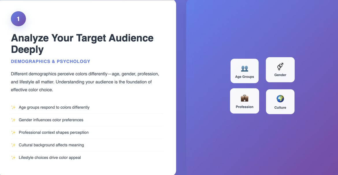
Step 1: Analyze your target audience deeply
Different demographics perceive colors differently—age, gender, profession, and lifestyle all matter.
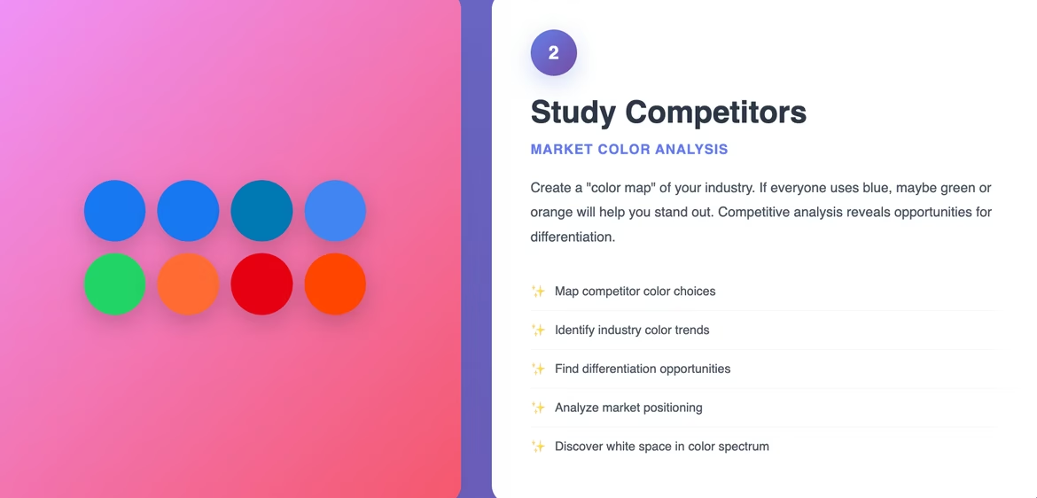
Step 2: Study competitors
Create a “color map” of your industry. If everyone uses blue, maybe green or orange will help you stand out.
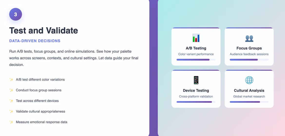
Step 3: Test and validate
Run A/B tests, focus groups, and online simulations. See how your palette works across screens, contexts, and cultural settings.
Global Color Perception
White means purity and new beginnings in the West, but mourning in parts of Asia. Red means prosperity in China but aggression in some African cultures. Green is sacred in Islam, yet in Latin America it may symbolize illness.
Successful global brands adapt: McDonald’s uses green in Muslim-majority countries; Coca-Cola tweaks shades for festive appeal; KFC leans into red in China for its cultural luck symbolism.
The Role of AI in Working with Color
AI tools can analyze millions of palettes, track industry trends, and even personalize color choices for audience segments. Neural networks already generate logos that account for psychology, culture, competitors, and user preferences. They don’t just follow trends—they help brands shape them.
Color Trends in 2025
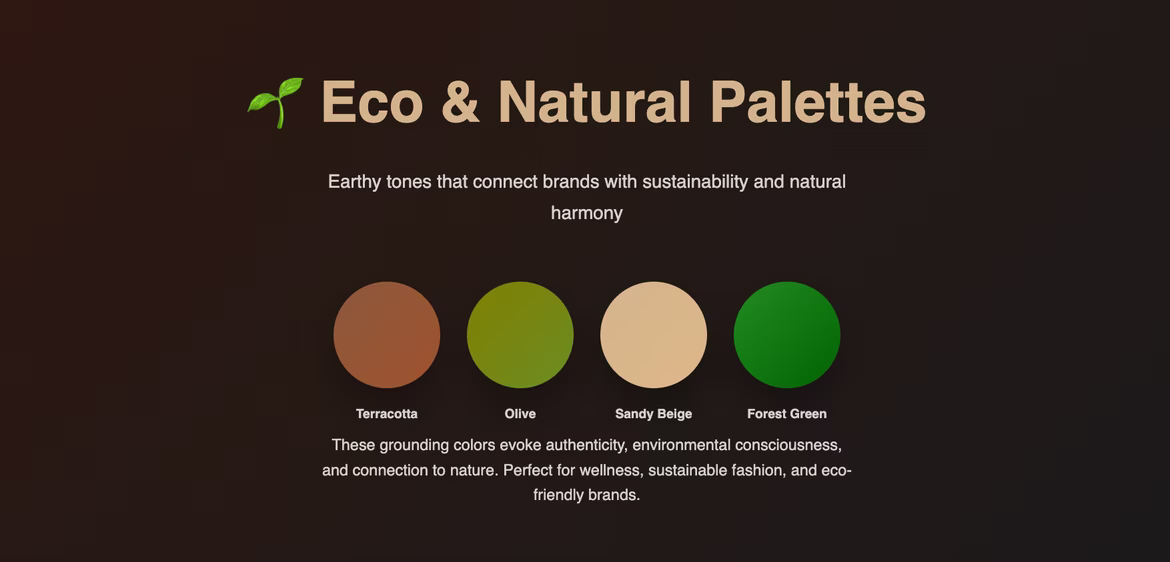
- Eco and natural palettes: earthy tones like terracotta, olive, sandy beige, forest green.
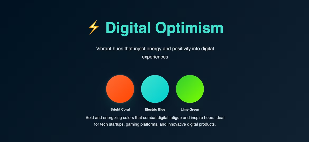
- Digital optimism: bright coral, electric blue, lime green bring positivity to digital spaces.
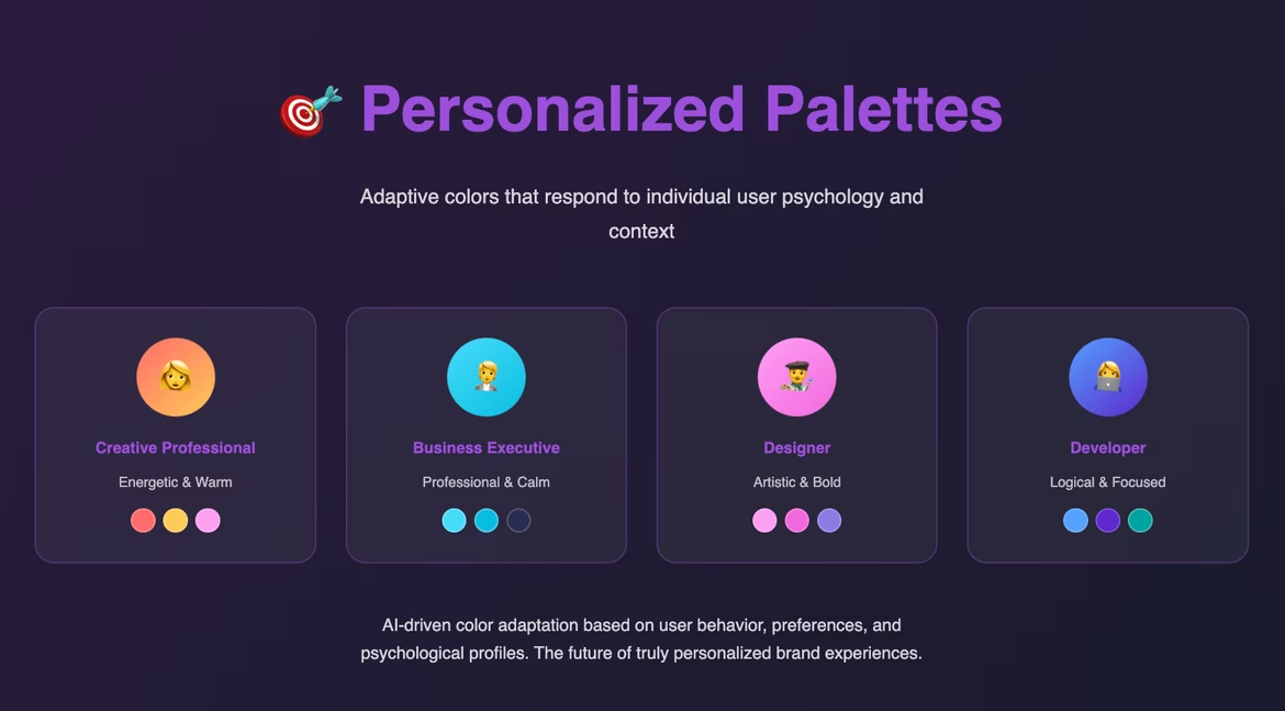
- Personalized palettes: adaptive colors tailored to each user’s psychology and context.
Conclusion
After a few months of working with colors, Lena’s projects began to feel different. Clients noticed that her designs inspired trust, made navigation easier, and even boosted sales. She realized: color psychology isn’t abstract theory—it’s a tool that changes perception and behavior.
Every shade carries emotion, sparks associations, and helps brands speak without words. In a world where attention drifts in seconds, color becomes the hook that holds the gaze and builds emotional bonds. Brands that master color will always stand out—and stay closer to their audience.
 Gradients in Logo Design: Secrets of Effective Application for Your Brand
  Design a Business Card That Stands Out: A Step-by-Step Guide
  Vector vs. Raster: Understanding Image Formats