Logo Not Working? How to Analyze and Fix Design Flaws


A logo is not just a visual element but a strategic asset of a company that directly influences brand perception, purchasing decisions, and long-term customer loyalty. Recent studies show that 75% of consumers form an opinion about a company's reliability based on its logo design, and 60% of buyers consciously avoid brands with outdated or unprofessional visual symbols.
In an era of rapid digital transformation, a logo can lose its effectiveness for many reasons. Technological shifts demand new standards for scalability and adaptability, evolving consumer preferences require a rethinking of visual communication, and changes in a company’s business strategy can render the current logo obsolete. Understanding when and how to adjust visual identity has become a critically important skill for today’s marketers and business leaders.
Proper diagnosis of logo issues enables informed decisions about whether changes are necessary—helping to avoid both premature spending on unnecessary rebranding and delayed responses to evident problems. A comprehensive approach to analyzing visual identity should combine quantitative metrics with qualitative evaluation, taking technical aspects into account alongside strategic objectives.
Diagnosing the Problem: When a Logo Needs to Change
Quantitative Indicators of Ineffectiveness
Modern analytics provides a variety of tools for objectively assessing a logo’s effectiveness. A decline in brand recognition in A/B testing is often the first warning sign—especially if the drop persists over several consecutive months. A decrease in organic traffic from branded search queries may also point to issues with how the brand is visually identified in search results.
Special attention should be paid to Brand Recall metrics in focus group studies. If participants are unable to recall your logo even an hour after a company presentation, that’s a clear indicator of weak visual memorability. Digital performance data can also be telling: a low click-through rate (CTR) in advertising campaigns may suggest the logo is failing to grab attention, and a high bounce rate on landing pages may reflect a mismatch between user expectations and actual brand perception.
To measure brand recognition (among other things), marketers often conduct a Brand Lift Study. These studies are available through many major ad platforms. The mechanics of Brand Lift are simple: it’s a survey-based study where viewers are asked multiple-choice questions during or after viewing an ad. The questions appear directly in the video player or in place of a banner. All selected users fall within the same targeting criteria, but only the test group sees the ad, while the control group does not. Based on the responses, marketers can evaluate brand awareness, ad recall, message retention, and more among the target audience.
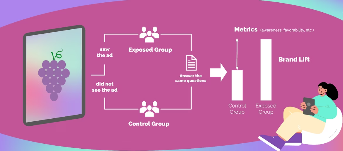
Source: Grape Seed Media
Low engagement on social media—especially poor numbers for shares and mentions—can suggest that the logo fails to inspire users to associate themselves with the brand. Today’s consumers actively express their preferences on social platforms, and a lack of such activity often signals problems with the brand’s visual appeal.
Qualitative Signals
Audience feedback provides invaluable insights into how a logo is perceived. Frequent customer questions about what the company actually does may indicate that the logo lacks clarity or fails to communicate the business’s core offering. Confusion with competitors is particularly dangerous in saturated markets, where strong differentiation is key to driving purchase decisions.
Negative comments about the company’s "outdated" appearance—whether in reviews or on social media—deserve close attention. Modern consumers, especially younger generations, are highly attuned to visual trends. An outdated logo may be interpreted as a sign that the company is behind the times in terms of quality or innovation.
Internal factors also play a critical role in evaluating the relevance of a logo. A shift in the business model—especially from traditional to digital services—often calls for a reassessment of visual identity. Expanding into new geographic markets can reveal cultural mismatches in the existing logo, while mergers and acquisitions almost always raise the question of whether a new, unified identity is needed.
Comprehensive Logo Audit Methodology
Strategic Analysis
The first stage of a professional logo audit should be a gap analysis between the brand’s current perception and its desired positioning. The Brand Wheel methodology offers a structured approach to evaluating how well the visual elements align with corporate values, mission, and brand promise. This analysis often reveals significant discrepancies between what the company aims to communicate and what the logo actually conveys.
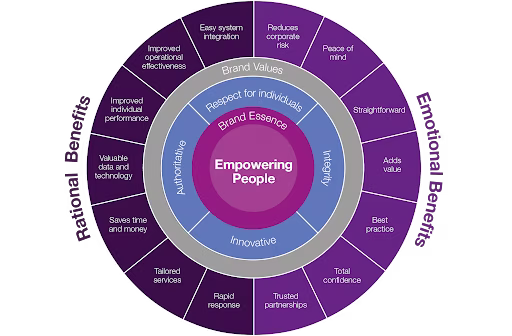
Source: Octant
Competitive Environment Analysis
Analyzing the competitive landscape requires building a detailed logo map within your niche. A professional assessment of differentiation is typically conducted using a ten-point scale, where one indicates complete similarity to competitors, and ten reflects a truly unique approach. Experience shows that companies scoring below four often face serious challenges with brand recognition and market positioning.
A basic SWOT model can serve as an example of this analytical approach:
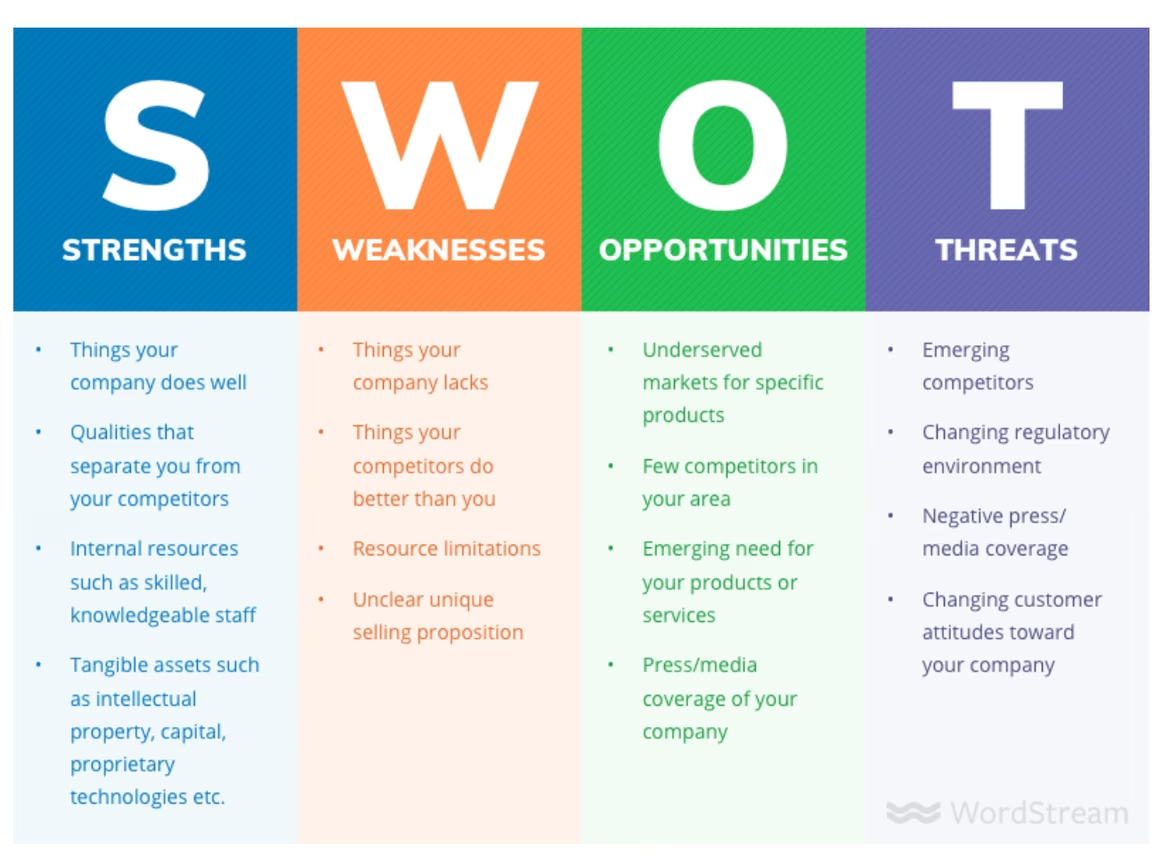
Source: Google images
An important aspect of strategic analysis is assessing the brand’s lifecycle.
Logos that were effective during the company’s early stages may become unsuitable for a mature business with an established reputation. Similarly, symbols that worked well on a local scale often require adaptation when expanding into international markets.
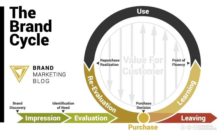
Source: Brand Marketing Blog
Technical Evaluation
Modern logo design must meet strict technical standards. A scalability test assesses legibility at a minimum size of 16x16 pixels—critical for favicons and mobile apps. At the same time, the logo should maintain clarity at resolutions up to 300 DPI for high-quality printing on large-format materials.
Logo adaptability is checked across square, horizontal, and vertical formats. Today's digital platforms demand various proportions—from square avatars on social media to wide banners in email campaigns. A logo that fails to adapt without losing recognizability imposes serious limitations on marketing communications.
Color versatility involves several essential tests. A logo must work effectively in black and white, especially for printed materials or when operating within a limited color budget. Compliance with WCAG 2.1 standards for visually impaired users is no longer optional—it’s a requirement for many markets and government contracts.
Color psychology also plays a crucial role, requiring the brand’s color palette to align with its emotional profile. Studies show that a poorly chosen color scheme can reduce a logo’s effectiveness by 20–30%, even if the composition is otherwise excellent.
Consumer Testing
The first impression test, also known as the five-second test, evaluates consumers’ immediate reactions to a logo. Participants are shown the logo for five seconds and then asked to describe their impressions and associations. This method is particularly effective in identifying unexpected or undesirable associations.
The semantic differential provides a quantitative assessment of logo perception across various characteristics: modern–outdated, trustworthy–untrustworthy, friendly–formal. This analysis helps pinpoint which specific aspects of perception need adjustment.
Eye-tracking analysis of visual perception reveals attention patterns when viewing a logo. This technology shows which elements attract attention first, how long the gaze lingers on different parts of the composition, and whether certain elements go unnoticed.
Critical Mistakes in Logo Design
Information Overload
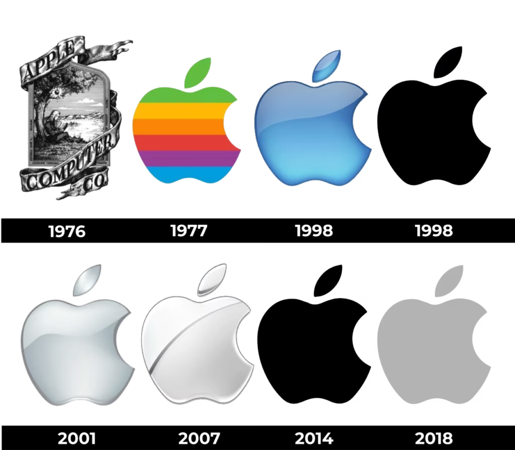
One of the most common mistakes is trying to fit the entire company history or the full range of services into the logo. This approach leads to a visually overloaded symbol that loses its primary function of quick brand identification. A classic example of this evolution is the transformation of Apple’s logo—from a complex drawing of an apple tree with many details to a minimalist bitten apple instantly recognized worldwide.
Source: Abella Graphic Design
The principle of "one logo — one idea" should be fundamental when developing or evaluating visual identity. Successful logos convey a single clear concept that resonates with the target audience and is easy to remember. Attempts to combine multiple ideas into one symbol inevitably lead to reduced communication effectiveness.
Typography Mistakes
Choosing a font for a logo requires special attention, as typography becomes the brand’s voice. Using standard system fonts like Arial or Times New Roman immediately reduces the logo’s uniqueness and makes it similar to thousands of others. Combining more than three different fonts in one logo creates visual chaos and hinders perception.
Special care is needed when adapting Western fonts for Cyrillic. Many international typefaces do not work well with Russian letters, causing imbalance in composition and reducing readability. A professional approach involves creating or carefully adapting a unique font that becomes an integral part of the branding. A successful example is Netflix Sans — a typeface specifically developed for the company’s needs and incorporated into its visual identity.
Color Mistakes
Errors in color usage can completely undermine even an excellent compositional design. Using more than four colors in the main version of a logo creates visual overload and complicates reproduction across various media. Ignoring cultural differences in color perception is especially critical for companies planning international expansion.
Lack of adaptation for printing in the CMYK color system often leads to unpleasant surprises in print production. Colors that look attractive on screen in RGB may change significantly when printed. A professional approach requires developing a complete color palette with precise values in RGB, CMYK, HEX, and Pantone systems.
Technical Shortcomings
Using raster formats instead of vector limits the logo’s scalability and applications. Lack of clearly defined padding and safe zones leads to composition disruptions when the logo is placed near other elements. Incorrect proportions during scaling can distort brand perception and reduce recognizability.
Many companies underestimate the importance of creating technically flawless logo files, which later causes problems when working with contractors, advertising agencies, and printing houses. A professional file package should include versions in various formats, color schemes, and sizes.
Trend Dependence
Logos that fully follow fashion trends quickly become outdated and require frequent updates. A balance between modernity and timelessness is achieved with roughly 70% timeless elements to 30% contemporary accents. This approach allows the logo to look current while maintaining long-term effectiveness.
Blind copying of popular design solutions without adapting to the brand’s specifics leads to loss of uniqueness. It is important to analyze trends and borrow principles rather than ready-made solutions, adapting them to the unique needs and values of the particular company.
Lack of Systematic Approach
A modern logo should be part of an integrated visual system including corporate colors and their gradations, typography for all information levels, iconography system, and composition principles for various materials. Isolated logo development without considering its integration into the overall communication system creates problems with scalability and brand consistency.
Lack of clear rules for logo usage leads to uncontrolled distortions by different company departments and external contractors. Creating a detailed brand book with examples of correct and incorrect usage becomes critically important for maintaining the integrity of visual identity.
Ignoring Usage Context
Neglecting the specifics of digital platforms leads to logos that perform poorly online. Lack of animated versions for web usage deprives the brand of modern tools for capturing attention. Poor readability on mobile devices is especially critical, given that over 60% of internet traffic comes from mobile platforms.
A modern logo must work effectively in social networks with their requirements for square avatars and round icons, in email signatures with limited space, in mobile apps with high readability demands at small sizes, in outdoor advertising requiring visibility from a distance, and in corporate documentation requiring a professional appearance.
Legal Issues
Copyright infringement during logo creation can lead to serious legal consequences and the need to completely change visual identity. Similarity to already registered trademarks creates risks of lawsuits and claims for damages.
Lack of legal protection for one’s own logo leaves the company defenseless against copying by competitors. Trademark registration should be done at the earliest stages of logo use, as the registration process can take up to 18 months.
Cultural Inadequacy
When entering international markets, it is critical to consider religious taboos, political connotations, and linguistic features of different cultures. Symbols or colors perceived positively in one culture may have negative associations in another.
The direction of reading and symbol perception also varies across cultures. A logo optimized for left-to-right perception may work inefficiently in countries with right-to-left or top-to-bottom reading traditions.
Insufficient Adaptation for Communication Channels
Each communication channel imposes specific requirements on the logo. Social networks require square avatars and round icons, email signatures limit size and resolution, mobile apps require high readability at small sizes, outdoor advertising must be legible from a distance, and corporate documentation demands a professional and restrained look.
Lack of adaptations for various channels leads to inconsistency in brand representation and reduced overall communication effectiveness. Modern requirements involve creating a whole system of logo variations for different usage scenarios.
Correction Strategies: From Restyling to Rebranding
Evolutionary Approach
Restyling is applied in situations where the current logo has high brand recognition but requires technical optimization or minor adjustments in positioning. This approach minimizes the risk of losing existing brand equity while allowing for modernization of the visual identity.
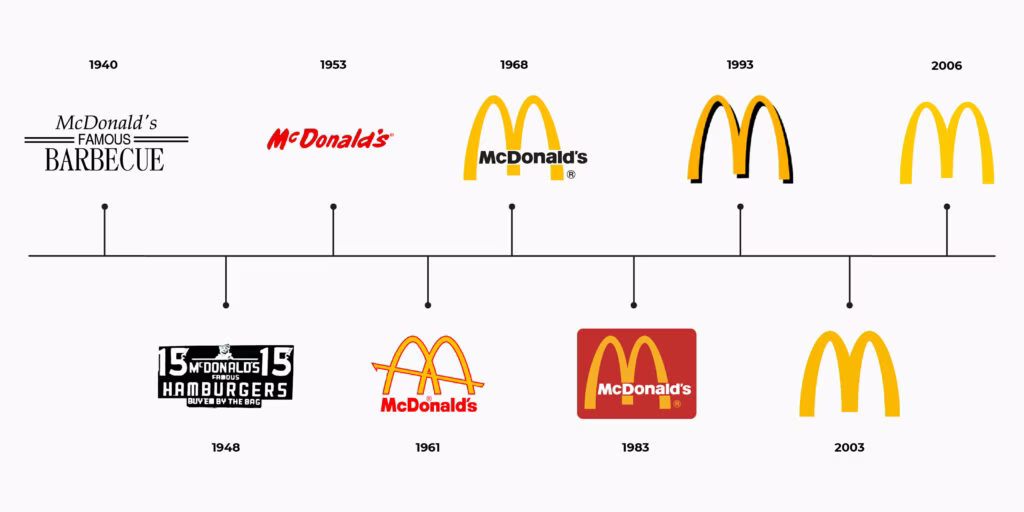
Successful examples of the evolutionary approach include McDonald’s simplification of the iconic golden arches, Google’s transition to a more geometric and legible font, and Mastercard’s removal of the textual element to focus on the symbolic overlapping circles. All these changes preserved brand recognizability while enhancing their functionality.
Source: Intersection
The process begins with careful identification of the key recognizable elements that must be preserved. Gradual introduction of changes allows the audience to adapt to the updated appearance without experiencing shock from drastic alterations. A/B testing of new versions helps evaluate market reactions and make adjustments before the full launch. An essential component is active communication with the audience, explaining the reasons and benefits of the update.
Revolutionary Approach
A complete rebranding is justified in cases of a fundamental change in strategy, entry into entirely new markets, the need to overcome negative associations, or as a result of mergers and acquisitions. This approach requires significant investment and carries high risks but can radically transform the company’s market perception.
The transformation of Facebook into Meta illustrates the complexity of a full rebranding. Changing the logo and brand identity required consideration of the company’s shift toward the metaverse, changes in its user base and product offerings, and stringent requirements for digital and mobile optimization. The success of this rebranding largely depended on thorough preparation and phased implementation of changes.
The complete rebranding plan includes several critical phases. The research phase, lasting four to six weeks, involves auditing the current brand perception, conducting an in-depth analysis of the target audience and its evolution, as well as detailed competitor analysis. The conceptual development phase takes six to eight weeks and involves creating three to five conceptual directions, testing them on focus groups, and performing legal checks for uniqueness.
The detailing and adaptation phase requires four to six weeks to develop a comprehensive brand book, create adaptations for all media, and plan the rollout process. The final implementation phase lasts eight to twelve weeks and includes the phased introduction of the new logo, training the team on usage guidelines, and continuous market reaction monitoring with readiness for quick adjustments.
Practical Tools for Self-Diagnosis
Comprehensive Logo Evaluation System
There is a universal logo test system developed by American graphic designer Paul Rand. His test includes 7 key criteria:
- Uniqueness
- Perceptibility
- Adaptability
- Memorability
- Global reach
- Timelessness
- Simplicity and minimalism
Each criterion is scored on a 10-point scale, except for simplicity and minimalism, which is scored out of 15 points.
The score interpretation is as follows:
- 65–75 points — excellent logo, requiring only regular performance monitoring
- 60–64 points — good logo with potential for minor improvements
- 40–59 points — major restyling needed
- Below 40 points — full rebranding required
Professional Analysis Tools
Modern software offers powerful tools for professional logo evaluation. Adobe Illustrator remains the industry standard for vector graphics and scalability analysis. Sketch is widely used by UI/UX designers to test logos in the context of user interfaces. LogoSlicer helps quickly check logo readability at various sizes.
Online services simplify the evaluation process:
- Brandmark Logo Rank uses AI to analyze logos and suggest improvements
- UsabilityHub offers user testing platforms with real user feedback
- Typeform enables creating interactive surveys for structured logo perception feedback
For logo creation, popular platforms include Ironov, Looka, LogoAI, Tailor Brands, and others.
For research and surveys, tools like Google Forms are often used for large-scale customer and prospect questionnaires. Hotjar provides insights into user behavior on websites, helping understand how visitors interact with logos in real conditions. These tools help gather objective feedback and identify areas for improvement.
Economic Justification for Changes
Return on Investment (ROI) Calculation
Justifying logo changes requires a clear understanding of costs and potential benefits. Direct expenses for logo design and development in the US typically range from $10,000 to $200,000, depending on project complexity and agency level. Legal fees for trademark searches and registrations usually range from $5,000 to $20,000.
The most significant costs often come from updating brand assets, especially for companies with extensive offline presence. These expenses can include replacing signage, printed materials, uniforms, vehicles, and digital assets. Such costs may range from $20,000 up to $500,000 or more, depending on company size and scope.
Industry studies show that a successful logo refresh can increase brand recognition by 15-40%. Conversion rates may improve by 10-25% due to enhanced perceptions of the company’s professionalism. Additionally, the perceived value of products or services can rise by 20-35%, enabling companies to raise prices or strengthen their competitive position.
The standard ROI calculation method applies the formula:
ROI = ((Revenue Increase − Rebranding Costs) ÷ Rebranding Costs) × 100%.
This metric helps businesses make informed decisions about investing in changes to their visual identity.
Payback Timeframes
The speed of return on investment (ROI) for a new logo varies significantly depending on the nature of the business.
- Fast payback within three to six months is typical for B2C companies with high purchase frequency, digital products and services, and brands with a strong online presence. These businesses can quickly test the effectiveness of the new logo and promptly see results.
- Average payback between six and eighteen months is common for B2B sectors, traditional industries, and regional companies. Longer decision-making cycles in these areas require more time for the new brand perception to take hold.
- Long-term payback from one to three years is characteristic of industrial enterprises, government organizations, and companies with extended sales cycles. In such cases, a logo change is viewed as a long-term investment in brand development.
In Conclusion
A logo is more than just an image—it’s a crucial element of visual identity that must perform effectively on all levels: from the first impression to long-term trust. It should be strategically aligned, technically flawless, and emotionally relevant to its target audience.
If a logo stops fulfilling its functions—losing recognition, failing to reflect the brand’s positioning, or causing confusion among users—this is not a reason to panic, but a signal for a deliberate and structured approach.
A professional audit helps identify the true reasons behind inefficiency, distinguish cosmetic issues from systemic problems, and make informed decisions about redesign or rebranding based on facts rather than subjective preferences. This approach helps preserve investments, strengthen the brand, and adapt it to evolving market realities.
In today’s world, where visual noise increases daily, a strong logo becomes a competitive advantage. The challenge for marketers, designers, and business owners is to ensure this element works for the brand—not against it.
 Gradients in Logo Design: Secrets of Effective Application for Your Brand
  Starting a Business in Russia: A Guide for Entrepreneurs
  What Is a Target Audience and Why It Matters for Your Brand