Gradients in Logo Design: Secrets of Effective Application for Your Brand

Gradients are experiencing a true renaissance in contemporary logo design. After years of minimalism dominating the industry, designers are once again turning to color transitions as a powerful tool for creating expressive visual identities. In 2025, gradients in logos are no longer just a fashion trend. They represent a conscious choice for brands seeking to stand out in an oversaturated information space.
Modern technologies enable the creation of smooth color transitions across almost any medium. Whether it’s a smartphone screen or a billboard, gradient logos look equally attractive, making them especially valuable for brands operating in the digital environment.
What Are Gradients
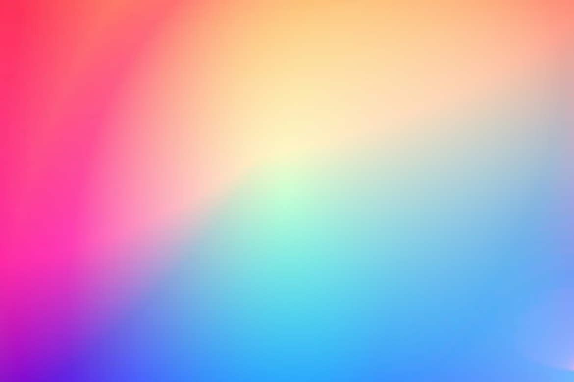
A gradient in logo design is a smooth transition between two or more colors, often creating an illusion of depth and motion. There are several types of gradients, each serving a different purpose.
Source: Google images
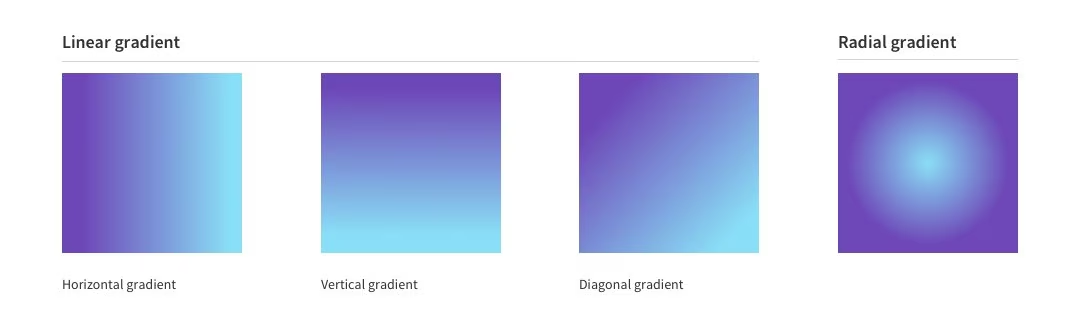
Linear Gradient
Linear gradients shift color along a straight line—horizontal, vertical, or diagonal. They are commonly used to suggest direction, growth, or movement. This style is simple yet effective, particularly for tech companies that want to highlight innovation and dynamism. The gradient moves the viewer's eye along a path, which can subtly reinforce the brand's core values or mission. Tinder's logo is a strong example, using a warm linear gradient to convey energy and attraction.
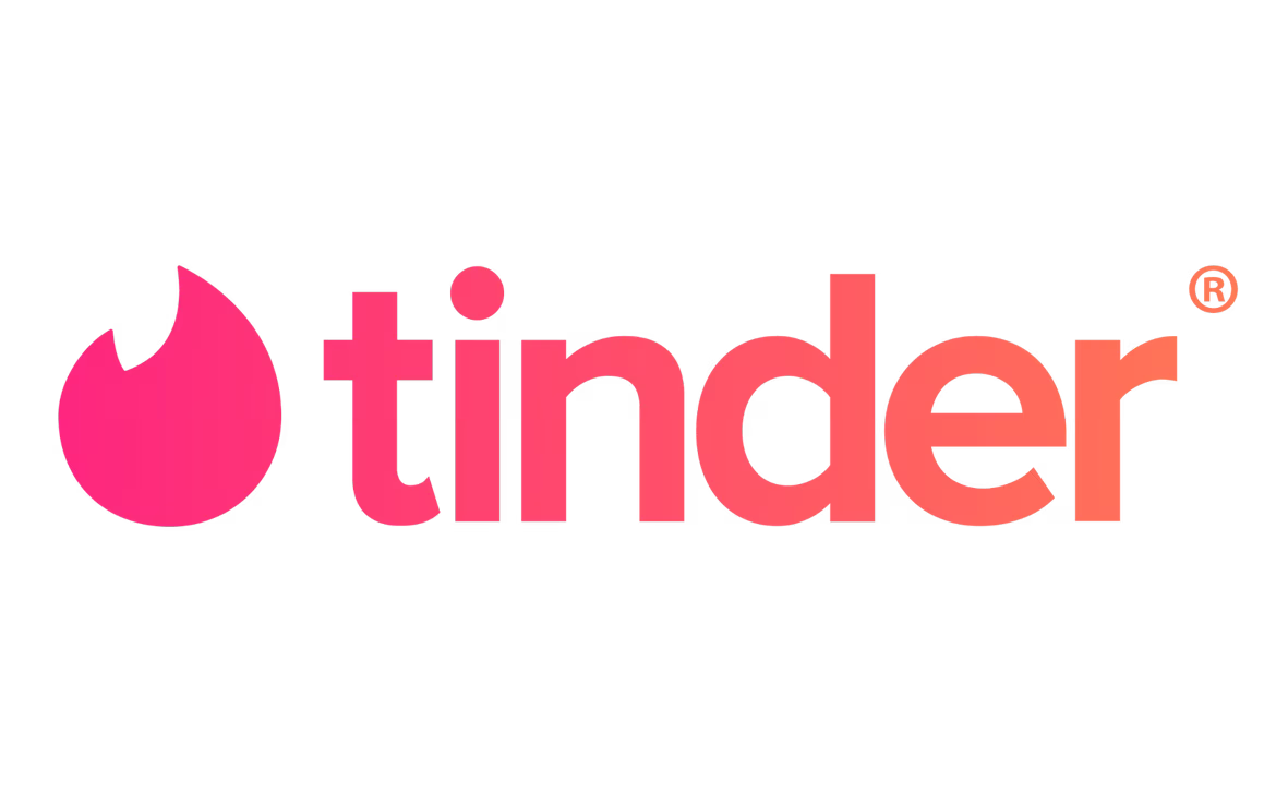
Source: Tinder
Radial Gradient
Radial gradients radiate outward from a central point, creating a glow or spotlight effect. This technique draws attention to the center and is ideal for logos that aim to convey inner strength or core focus. Brands often use radial gradients to simulate depth or to add a soft, luminous feel that enhances emotional resonance. Asana’s logo utilizes this type of gradient to emphasize balance and energy.
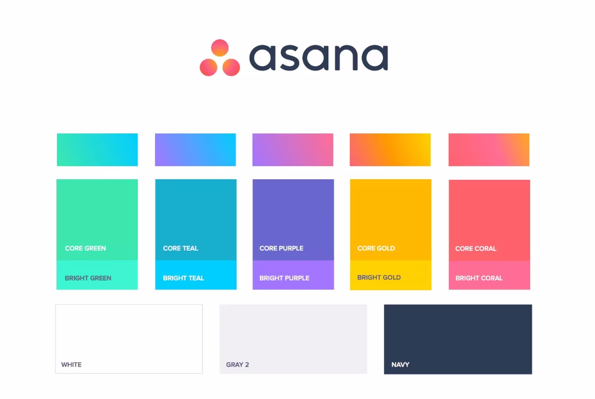
Source: Asana
A Brief Evolution of Gradients
Gradients have come a long way—from decorative flourishes in early web interfaces to sophisticated tools of brand identity.
The Skeuomorphic Era
In the 1990s and early 2000s, gradients were primarily used to imitate real-world materials and surfaces. Buttons appeared raised, icons looked tangible, and visual cues helped users navigate digital interfaces intuitively. This style was especially prevalent in operating systems like Windows XP and early Mac OS versions, where realism made technology feel familiar.
Source: 1000 Logos
The Flat Design Shift
With the rise of smartphones and responsive design in the early 2010s, there was a collective move toward simplification. Apple and Google led the shift to flat design, which discarded shadows and textures in favor of bold, simple colors and shapes. Gradients were largely abandoned during this period as designers prioritized speed, clarity, and cross-platform consistency.
Source: Lien Design
The Rise of Flat 2.0
Soon, designers realized that the absence of depth created usability challenges. Flat 2.0 emerged as a compromise, bringing back subtle gradients and shadows to enhance user experience without sacrificing minimalism. These updated gradients were more restrained, used to signal interactivity and improve visual hierarchy rather than decorate.
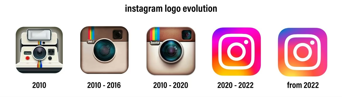
Gradients as Brand Identity
By the mid-to-late 2010s, gradients became integral to brand storytelling. Instead of being a UI trick, they evolved into core identity assets. Instagram’s 2016 rebrand showcased a vibrant gradient icon that stirred debate but ultimately became iconic. This paved the way for other digital brands to experiment with gradients in their core visuals.
Source: PUBBLI
Source: Google images
What Modern Gradients Look Like
Today, gradients are a rich visual language. Designers use them with noise textures, grain, blur, glass effects, fluid shapes, and even animation. They can be soft or vivid and appear in websites, presentations, packaging, apparel, and of course, logos.
Benefits of Gradient Logos
Gradient logos solve a range of branding tasks and offer strong advantages over monochrome designs.
Attention-Grabbing
Gradients naturally attract the eye because of their dynamic color shifts. This makes them excellent tools for brands seeking quick recognition or standing out in cluttered digital environments. The visual complexity of gradients holds a viewer's attention longer, increasing brand recall and engagement.
Depth and Volume
Using gradients in logos adds a sense of dimensionality, making flat surfaces appear layered or textured. This can make a logo feel more "real" and tactile, even on screens. For industries like tech, where trust and reliability are key, a logo with perceived volume can subtly communicate substance and depth.
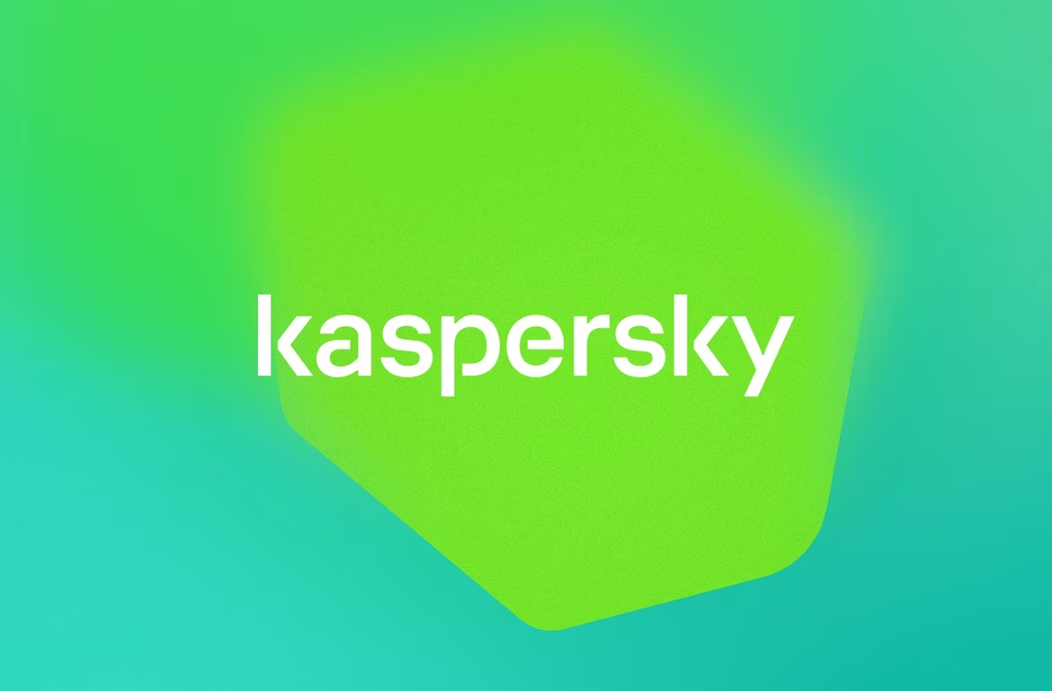
Source: Kaspersky
Emotional Expression
Colors evoke emotions, and gradients magnify that effect by blending emotional cues across a spectrum. A gradient from blue to purple can suggest creativity and security, while one from yellow to red may radiate warmth and excitement. Used strategically, gradients help convey the personality of a brand more effectively than flat colors.
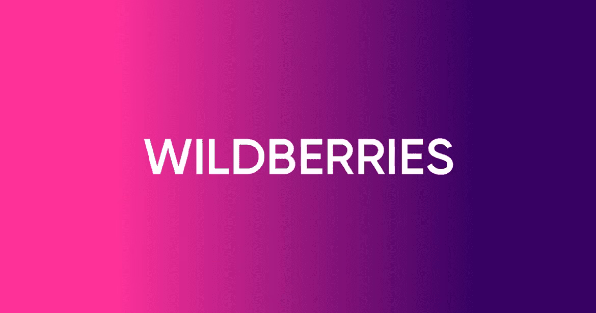
Source: Wildberries
Brand Differentiation
In an age of templated, look-alike logos, a custom gradient can become a brand's signature. The uniqueness of a gradient is hard to replicate, giving it built-in defense against imitation. Moreover, custom gradients create memorable first impressions, helping brands stake out visual territory in competitive markets.
How to Use Gradients Effectively
Creating a successful gradient logo requires mastery of color theory, brand positioning, and design principles.
Choosing a Color Palette
Every gradient starts with color selection. This isn’t just about aesthetics—each color and transition carries psychological meaning. Designers must balance brand personality, user expectations, and contextual use cases when selecting hues.
Harmonious Combinations
Analogous colors create a gentle and natural gradient effect. These transitions feel smooth and calming, reinforcing ideas of stability, trust, and maturity. For example, a green-to-blue gradient might be used in healthcare or finance to project calm authority.
Source: Pinterest
Contrasting Combinations
Complementary colors form striking gradients that demand attention. When well executed, these gradients increase memorability and visual impact. They are especially effective for startups and disruptors that want to break conventions or appeal to younger, trend-savvy audiences.
Source: Pinterest
Monochromatic Gradients
Gradients using variations of a single hue feel refined and polished. These are often found in luxury branding or corporate sectors where subtlety and elegance matter. For instance, shifting from blush pink to burgundy can suggest sophistication without overwhelming the viewer.
Source: Pinterest
Direction and Shape
The angle of the gradient influences the narrative. Vertical gradients evoke upward movement or growth, horizontal gradients suggest balance and harmony, and diagonal gradients imply change or progress. Choosing the right direction adds meaning without adding complexity.
Gradients in Typography
Applying gradients to text can be powerful but risky. Poorly executed, gradients can reduce readability and usability. The key is to use them sparingly, often on display type or headlines, and to ensure strong contrast with the background. Heavy, sans-serif fonts typically handle gradients better than serif or script fonts.
Gradients in Symbols
Logo marks and icons can leverage gradients for added expressiveness. The challenge is in retaining clarity at small sizes. Overly complex gradients can muddy the design. A well-crafted gradient symbol enhances visual identity without compromising legibility or scalability.
Making Gradient Logos Adaptive
Logos should look good on all formats—business cards, websites, signage, packaging.
Multiple Versions
A flexible brand system includes full-color, simplified, and monochrome variants of a gradient logo. Designers must test visibility and consistency across light and dark backgrounds, small formats, and various print techniques to ensure brand recognition under all conditions.
Common Mistakes to Avoid
Even experienced designers make errors when working with gradients.
Overcomplexity
Including too many colors or overly busy transitions creates visual noise. A gradient should support the brand message, not overwhelm it. Limiting color stops and focusing on clarity keeps the design clean and effective.
Harsh Transitions
Smoothness is key to professional-looking gradients. Sudden shifts or banding between colors can cheapen the look. Designers should test gradients at multiple resolutions to ensure fluid transitions and eliminate artifacts.
Ignoring Print Limitations
Not all digital gradients translate well to print. Certain colors may shift when printed with CMYK inks. Testing gradients early in the design process prevents surprises and ensures consistent reproduction across materials.
Mismatched Style
A gradient should align with brand tone and audience expectations. A tech startup may thrive with a bold neon gradient, while a law firm would likely benefit from a subtle monochromatic scheme. Visual style must reflect brand values.
Gradient Trends in 2025
Gradient use continues to evolve alongside design culture and technology.
Pastel and Muted Tones
Soft color transitions dominate in industries like wellness, beauty, and sustainability. These palettes project calm, intimacy, and authenticity. From mint to peach or lavender to beige, these gradients evoke gentleness and care.
Neon and Futuristic Effects
High-intensity gradients with electric blues, acidic greens, or hot magentas project energy and modernity. These bold styles are favored by gaming companies, fintechs, and digital-first brands that thrive on edge and excitement.
Gradient Backgrounds
Rather than using gradients in the logo itself, designers often apply them as a backdrop. This allows logos to remain clean while still benefiting from the energy and emotion that gradients bring. It also offers flexibility across marketing materials.
3D and Volumetric Effects
Designers are using gradients to create the illusion of volume, especially when layering multiple gradients. This trend adds a tactile, dimensional quality to flat visuals and is ideal for showcasing innovation and sophistication.
Animated Gradients
Gradients that shift over time bring motion to branding. These dynamic visuals are perfect for websites, apps, and digital ads. They help logos feel "alive," encouraging viewer interaction and creating immersive experiences.
The Role of AI in Gradient Design
Artificial intelligence is reshaping how gradients are created and used in branding.
Palette Generation
AI tools can instantly generate harmonious color schemes based on data from millions of designs. These tools consider not only color theory but cultural trends, emotional responses, and industry conventions to produce optimized palettes.
Automatic Optimization
AI can adapt gradients for different screens and formats. It ensures that colors remain readable and aesthetically pleasing across light and dark modes, small and large screens, and various display technologies.
AI Tools in Use
Platforms like Adobe Sensei, Figma AI, Coolors, and Gradient Hunt make professional-level gradient generation accessible to non-designers. These tools suggest combinations, preview results, and provide export-ready assets for multiple use cases.
The Future of Gradient Logos
Designers and brands are pushing gradients into new frontiers.
Interactive Gradients
Future gradients may respond to time of day, weather, or user behavior. This type of interaction creates a more personal, dynamic brand experience. A logo that shifts color based on ambient light or context adds relevance and novelty.
Augmented Reality Gradients
In AR environments, gradients can glow, pulse, or move in 3D space. This adds a magical, futuristic dimension to branding and allows logos to become interactive spatial elements in virtual settings.
Sustainable Color Systems
Environmental concerns are pushing brands toward eco-conscious design choices. Sustainable gradients reduce energy use on OLED screens or use fewer resources during print production. These strategies align with broader ESG goals.
Cross-Cultural Adaptation
As brands scale globally, gradients must resonate across cultures. AI can help tailor color palettes to regional meanings, sensitivities, and preferences, ensuring broad appeal and minimizing misinterpretation.
Final Thoughts
Gradients are no longer just a trend—they're a powerful tool in brand identity. They convey mood, stand out in crowded markets, and engage the senses. Used wisely, gradients can strengthen emotional connection, support clarity, and elevate a logo into a long-lasting brand asset. With advances in AI and design tech, their creative potential is only just beginning.
 How to Write a Business Plan
  The Psychology of Color
  50 AI Tools for Modern Brand Managers