Brand Identity


Vladimir had run a household goods store for many years. The assortment was wide, the prices fair, but customers often confused his shop with neighboring ones. The signboard did not stand out, the bags were ordinary white, and the window notices looked like everyone else’s. “The main thing is good goods, the rest doesn’t matter,” he thought. But one day he heard from a regular customer: “I wanted to recommend your shop to my neighbor, but I didn’t even know how to describe it. They’re all the same.” At that moment Vladimir realized: without a corporate identity his business seems to get lost among competitors.
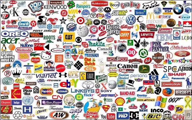
Imagine this: you walk down the street and see a red-and-white soda can. Even if it has no name on it, you will immediately think of Coca-Cola. That is how corporate identity works — a system of visual solutions that makes a brand instantly recognizable among hundreds of competitors.
Many business owners think that corporate identity is a pretty logo on a business card. In fact, it is much more. It is the language your company uses to speak to the world. Every color, every font, every line tells a story about who you are and how you differ from others.
Source: Slavikap
What is corporate identity
Definition in simple words
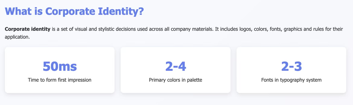
Corporate identity is a set of visual and stylistic decisions that are used across all company materials. It includes the logo, colors, fonts, graphics and the rules for their application. The goal is one — to make people recognize your brand at first glance.
When you see a yellow-black taxi, you think of “Yandex.Taxi.” When you see a paper airplane icon for an app, you remember Telegram. This is the result of thoughtful work on corporate identity.
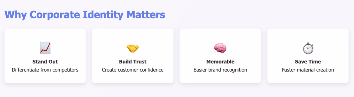
Why corporate identity is needed
Imagine a shop where the name, sign color and placement of goods change every day. Customers will simply get confused and go to competitors. The same happens with a brand that has no unified style.
Corporate identity solves several tasks:
-
Helps stand out among competitors
-
Builds trust with customers
-
Makes the brand easier to remember
-
Saves time when creating new materials
-
Increases the perceived value of products or services
Differences from brand identity and the brand book
These terms are often confused, but there is a difference between them. Brand identity is a broader concept. It includes not only the visual side but also the brand’s philosophy, its values, and the tone of communication with the audience.
The brand book is the document that prescribes all the rules for using the corporate identity. It specifies how to place the logo correctly, which colors to use, how to write texts. It is an instruction for those who will work with the brand.
Corporate identity sits between them. It is more concrete than brand identity, but broader than just a logo.
Main elements of corporate identity
Logo as the central element
The logo is the face of your brand. It should be simple, memorable and appropriate. A good logo works at any size — from a huge banner to a tiny app icon.
Several factors are taken into account when creating a logo. It should reflect the character of the company and be understandable to the target audience. A kindergarten can use bright colors and playful shapes. A law firm will choose a strict typeface and a restrained palette.
A modern logo should be adaptive. This means it can change depending on the medium while remaining recognizable.
Creating a logo with a neural network
Neural networks have changed the approach to logo design. Now it is possible to get dozens of variants in a few minutes that previously would have required hours of a designer’s work.
Ironov is a specialized neural network for creating a full corporate identity. Unlike general image generators, it understands the specifics of branding and creates not just pretty images but well-thought-out design solutions.
The system analyzes your request (you can specify your business description, industry, target audience) and proposes logo options taking all these factors into account. At the same time, each logo is adapted for different media — from business cards to outdoor advertising.
But a neural network is a tool, not a replacement for creativity. It can propose interesting ideas or help quickly create a prototype. The final decision and refinement are better left to a human.
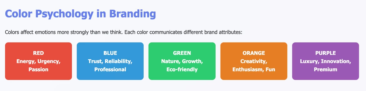
Corporate colors and their psychology
Color affects emotions more strongly than we think. Red evokes a sense of urgency and energy. Blue is associated with reliability and professionalism. Green is connected with nature and growth.
We wrote in more detail about color psychology and how it influences brand perception in this article.
A corporate palette usually includes 2–4 primary colors and several additional shades. It is important to consider how colors combine and how they look on different media.
When choosing colors think about practicality. Bright neon green may look great on screen but print poorly on business cards. Consider the specifics of your industry — medical companies often use white and blue, while eco brands prefer green tones.
You can generate a color palette using the free generator by Ironov.
Rules for working with the color palette
A professional color palette includes not only the main colors but also their shades, gray scales, and rules of combination. This helps create varied yet coherent materials.
It is important to consider color behavior in different conditions. How will the palette look on a dark background? What happens in black-and-white printing? Which colors to use for accents and warnings?
Typography as the brand’s voice
Fonts convey character no less than colors. Classical serif suggests tradition and reliability. A modern sans-serif speaks of technology and simplicity. Handwritten fonts create a sense of personal approach.
A corporate identity usually uses 2–3 fonts: one for headings, another for body text. Sometimes an accent font is added for special cases.
Readability is crucial. A beautiful decorative font may not be suitable for long texts. A strict corporate font may look boring on social media.
Hierarchy of fonts
A proper typographic system includes not only the choice of fonts but also rules for their use. What size for H1? What spacing between paragraphs? How to highlight important information?
A good typographic system works across all formats — from big posters to mobile apps. It remains readable and attractive in any context.
Graphic elements and patterns
The logo and text are the base, while graphic elements add individuality. These can be geometric shapes, lines, patterns, illustrations or photographs in a particular style.
Graphic elements help create cohesion even where there is no logo. A characteristic pattern on packaging or a special icon style in an app makes the brand recognizable.
When developing graphics it is important to think about scalability. An element should look good on a large billboard and on a small label.
Applications of corporate identity
Corporate identity doesn’t live in a vacuum, but on concrete media. Business cards, letterheads, website, packaging, signboards — all of these should look like parts of a single whole.
A modern brand exists in many formats at once. Print materials, digital interfaces, outdoor advertising, promotional merchandise — a unified system should be present everywhere.
Stages of creating corporate identity
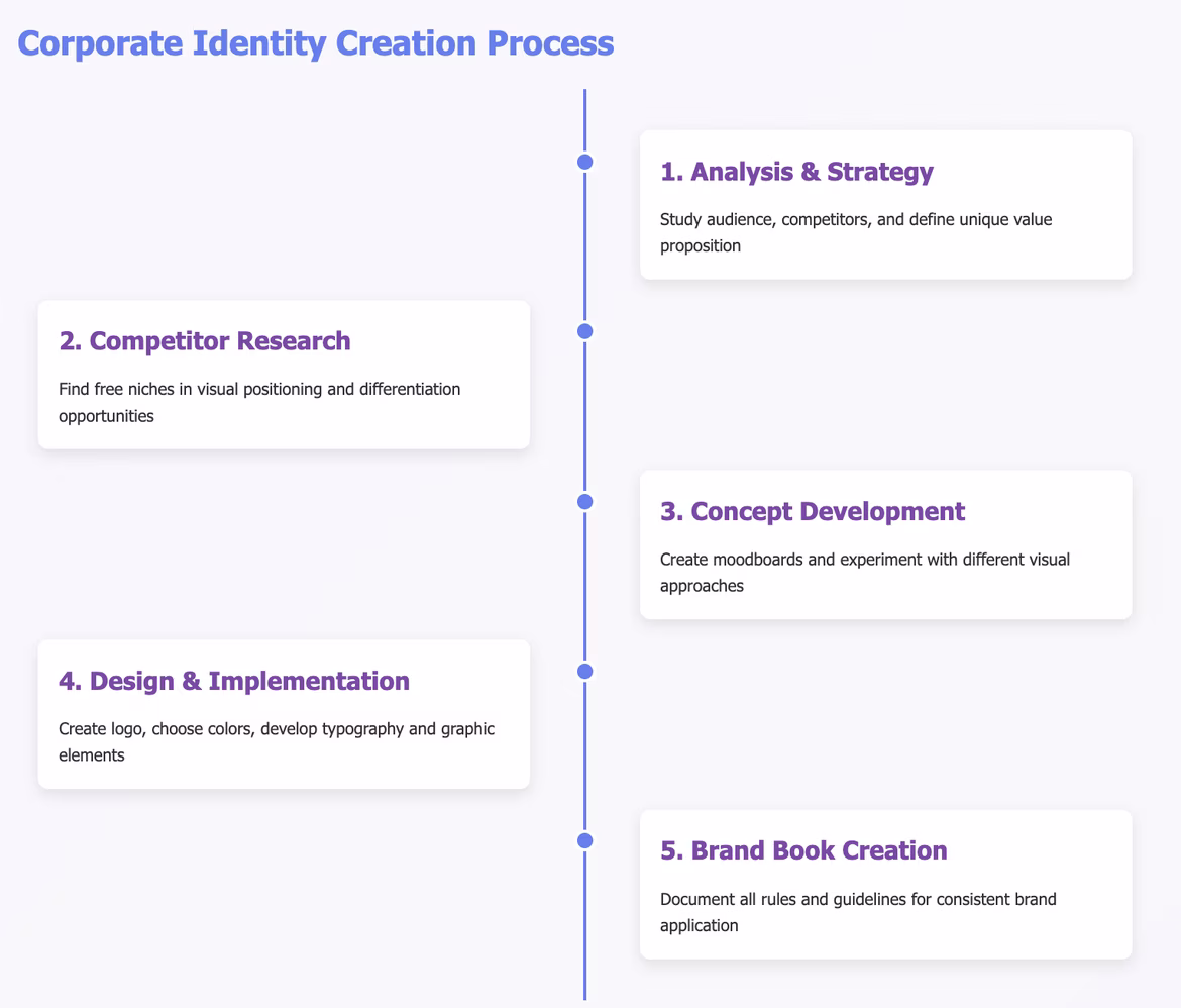
Analysis and strategy
Before drawing a logo you need to understand for whom and why you are doing it. Study your audience, look at competitors, define your unique value proposition.
Ask yourself: which emotions should your brand evoke? Where will the corporate identity be used? What budget do you expect? Answers will help make the right choices in the next stages.
Create a portrait of the target audience. Young IT specialists will like one style, bank executives — a completely different one.
Competitor research
Analyzing competitors helps find free niches in visual positioning. If all companies in your industry use blue, maybe it’s worth choosing another color.
But do not copy others’ solutions. The goal of research is to understand how to stand out, not to repeat what already exists.
Concept development
At this stage gather ideas and create the general direction. It is useful to compile a moodboard — a collage of images that convey the desired mood.
Experiment with different approaches. Try minimalism and maximalism, strictness and playfulness. Don’t fixate on the first idea that comes to mind.
Test concepts on focus groups or among acquaintances. External perspectives help reveal weak spots and find unexpected solutions.
Creating a moodboard
A moodboard is a visual map of the future style. Collect images that reflect the brand’s character. These can be photos, illustrations, samples of typography, color combinations.
A good moodboard tells a story without words. Looking at it, anyone should understand what character the brand has and which emotions it should evoke.
Design and implementation
Now move to practical work. Create the logo, choose colors and fonts, develop graphic elements.
Work sequentially. First the logo, then the color palette, then typography. Each new element should harmonize with the already created ones.
Create variants for different situations. The logo must work in color and in black-and-white, in horizontal and vertical compositions.
Iterative process
Creating a corporate identity is an iterative process. First versions are rarely final. It is important to create several versions, test them, get feedback and refine.
Do not be afraid to change direction radically if something does not work. It is better to spend more time at the development stage than to redo all materials later.
Creating a brand book
A brand book is a guide on how to use the corporate identity. It prescribes all rules: how to place the logo, what clearances to follow, which colors to use in different situations.
A good brand book should be understandable even for someone who is not a designer. Include examples of correct and incorrect uses of elements.
The brand book is a living document. Over time it can be supplemented with new elements and rules.
Brand book structure
A classic brand book includes several sections: brand philosophy, logo and its variations, color palette, typography, graphic elements, examples of application, and unacceptable uses.
The volume can vary — from a few pages for a simple style to hundreds of pages for complex corporate systems.
Role of corporate identity in branding
Visual communication without words
Corporate identity speaks to customers in the language of images. A person evaluates visual information in fractions of a second and draws conclusions about a company.
A strict black-and-white style will convey seriousness and professionalism. Bright colors and unusual shapes will tell of creativity and innovation. Natural tones and organic shapes will emphasize eco-friendliness.
A properly chosen style attracts the right audience and repels the wrong one. This saves time and resources on dealing with unsuitable clients.
First impression
You have only 50 milliseconds to make a first impression. In that time a person assesses visual information and decides whether to trust your company.
Corporate identity must instantly convey the brand’s key messages. Reliability, innovation, accessibility, premium — all of this can be expressed through design.
Saving resources
When a corporate identity is ready, creating new materials becomes faster and cheaper. You don’t need to reinvent which colors to use or how to place elements every time.
A designer or marketer simply follows the ready rules. This minimizes errors and maintains consistency across all company materials.
Customers and employees quickly get used to the brand’s visual language and accept new information more easily.
Business scaling
As a business grows, new products, services and touchpoints with customers appear. Corporate identity helps maintain consistency across all communication channels.
A new employee can quickly understand how company materials should look if they have clear rules and examples.
Increasing customer loyalty
People trust consistent brands. When a company looks the same across all touchpoints, it creates a sense of stability and reliability.
A recognizable style acts as an anchor in memory. A customer sees familiar colors or shapes and immediately remembers a positive interaction with the brand.
Emotional connection
Corporate identity helps create an emotional bond between the brand and the customer. Familiar visual elements evoke positive associations and strengthen loyalty.
This is especially important in competitive markets where products differ little in functionality. Emotional attachment becomes a deciding factor in choice.
Neural networks in developing corporate identity
Generation of comprehensive solutions
Neural networks have become an indispensable tool for creating holistic corporate identities. Ironov is a vivid example of a specialized system that understands the interrelation of all branding elements.
Unlike general image generators, Ironov creates not separate elements but full corporate identities. The system generates a logo, selects a harmonious color palette, creates patterns and even develops business card layouts that perfectly match each other.
A feature of this approach is understanding the business context. The neural network takes into account industry, company size, target audience and produces solutions that work for the specific case.
Understanding business context
Specialized neural networks analyze not only visual preferences but also business tasks. They understand the difference between a technology startup and a family bakery, between B2B and B2C segments.
This allows creating not just beautiful but functional solutions that help achieve business goals.
Comprehensive generation of elements
Generating many logo variations, selecting harmonious color palettes, generating patterns — these tasks take a lot of time. Ironov handles them in minutes while creating logically linked elements.
The system can generate dozens of identity variants for one business, each having its own character while fitting the company’s needs. This allows choosing the optimal solution or combining the best elements from different options.
Ironov also creates ready-to-use mockups for practical application — business cards, letterheads, presentations. This saves time when adapting the style to specific media.
Speed of iterations
Traditional development of corporate identity can take weeks or months. Neural networks make it possible to receive and test many variants within hours.
Fast iterations are especially important for startups and small businesses that need to quickly enter the market with a ready visual solution.
Limitations and possibilities
Specialized neural networks like Ironov solve many limitations of general generators. They better understand design principles, create more balanced solutions and consider practical aspects of usage.
But it is important to remember that a neural network is a tool for idea generation and rapid prototyping. Final decisions, adaptation to specific tasks and testing on the target audience remain the human’s responsibility.
Use neural networks as a starting point for the creative process. They can propose unexpected solutions or help overcome creative blocks, but they will not replace understanding the business and customer needs.
The future of AI in design
The development of neural networks does not stop. Already systems appear that can analyze emotional reactions to design, predict the success of visual solutions, and adapt a style for different cultures and markets.
In the future neural networks will become even more precise assistants for designers, but human creativity and contextual understanding will remain indispensable.
Common mistakes in creating corporate identity
Copying competitors
The most common mistake is outright copying successful competitors. This creates confusion in customers’ minds and robs the brand of individuality.
Studying best practices is useful, but it is important to find your own unique path. Your style should reflect your own values and features.
Lack of research
Many create corporate identity based only on personal preferences. But it is important to understand how your decisions are perceived by the target audience.
Conduct simple surveys, show variants to focus groups, test solutions in practice. Feedback will help avoid costly mistakes.
Ignoring scalability
A logo that looks great on a business card may be unreadable on a website or social networks. Always check how elements work in different sizes and formats.
Create versions for different situations in advance. This will save time and ensure quality reproduction across all media.
Excessive complexity
The desire to make a logo “richer” and “more interesting” often leads to overloading with details. Remember: simplicity is the foundation of memorability.
A good logo should be easily reproducible, quickly memorable and work in black-and-white.
Inconsistent application
Creating a corporate identity is only half the job. The main thing is to apply it consistently across all company materials. Deviations destroy the brand’s integrity.
Train all employees in the rules of use. Create simple templates for routine tasks.
The future of corporate identity
Personalization and adaptability
Future corporate identities will be more flexible and personalized. Logos will be able to change depending on context, audience, time of day or even the user’s mood.
Machine learning technologies will allow creating individual brand versions for each client while preserving overall recognizability.
Integration with technologies
Augmented reality, voice interfaces, the Internet of Things — all of this will require new approaches to visual identity. Brands will have to work not only in traditional media but also in new technological environments.
Sound logos, tactile elements, interactive graphics will become an integral part of corporate identity.
Eco-friendliness and social responsibility
Modern consumers pay increasing attention to sustainability and social responsibility. Corporate identities will reflect these values through material choices, production methods and design approaches.
Minimalism, natural colors, and eco-friendly printing materials — these trends will only strengthen.
Conclusion
A few months later Vladimir’s shop was transformed. A bright sign with a recognizable symbol appeared in the window, the bags and price tags received corporate colors, and the employees began to wear identical aprons. Customers now easily found the shop and recommended it to friends: “Go to the one with the green hammer on the sign.” Sales increased, and Vladimir realized: corporate identity is not about prettiness, but about recognizability, trust and customers’ memory. In a world where even household goods are bought with the eyes, it is visual identity that helps a brand take its place in people’s lives.
Corporate identity is a powerful communication tool that works on all levels of interaction with the audience. It forms the first impression, creates an emotional bond with customers, increases recognition and the perceived value of a brand.
Modern technologies, including neural networks like Ironov, make creating a quality corporate identity more accessible to businesses of any size. But technology is only a tool. The main things are understanding goals, audience and the uniqueness of your offering.
Investing in corporate identity pays off through increased customer loyalty, greater brand recognition and simplified marketing communications. Companies with strong corporate identities gain a competitive advantage that is hard to copy. A good corporate identity is not a one-off task but a long-term development strategy. Start with something simple, but do it thoughtfully and consistently. The result will not keep you waiting — your brand will become more recognizable, attractive and successful.
 Mascot
  Target Audience
  Color Wheel