Leading: What It Is, Why It Matters, and How to Calculate It
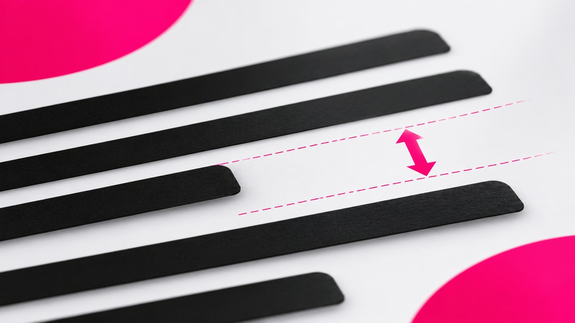

Layout designer Max received an urgent order to lay out a longread for a major media outlet. The text was ready, the fonts were chosen, the layout was built according to the grid. But on the first round of user testing, it became clear: people were not reading the article to the end. Their eyes got tired by the third paragraph, the lines merged, and focus was lost. The customer was perplexed: the article was excellent, the design was modern. The problem turned out to be one invisible setting — leading. Max changed the line spacing, and the text seemed to breathe: readability increased, and the read-through rate grew by one and a half times. This story shows that even a microscopic detail in typography can destroy or save an entire design.
What Leading Is
Leading is the space between the baselines of lines in a paragraph of text, that is, between those invisible lines on which the letters seem to stand. In professional circles, it is also called line spacing. In English-language publications and non-localized graphic editors, the terms line height or line spacing are used.
In design and typography, it is important to consider leading when setting text. The right amount of space makes the text more legible, visually attractive, and comfortable to read.
Why Leading Matters
The distance between lines plays a key role in readability. Too little leading causes the upper and lower lines to merge visually. This makes it difficult to focus the gaze, interferes with concentration, and makes it hard to understand the text, especially if the font size is small.
Too much spacing between lines also creates problems. It becomes difficult for the reader to find the continuation of the text, which leads to uncertainty and fatigue. Lines with wide spacing stop being perceived as a single block; words look like they are hanging in the air and are not connected to each other.
The right interval helps the eye move easily from line to line, facilitating reading and memorization of the text. A correctly chosen leading is crucial for achieving harmony, functionality, and beauty in typography.
Where Leading Is Used
The concept applies in all contexts where text is present, including print and digital media, web design, and printing.
Printing
Leading is used in print media: books, magazines, newspapers, as well as in advertising printing (business cards, leaflets, posters). In these contexts, it is important to choose the right line spacing so that the text is legible. When choosing, the font size, its style, and the language of the text are taken into account, since different combinations require different amounts of space.
Digital Design
In digital media (websites and applications), text is present everywhere: on banners, in social media posts, on web pages, in pop-up windows. Here it is important to choose a line spacing that corresponds to the screen size and resolution, as well as the user's device and reading habits.
How to Choose the Right Leading
Many sources name the average value of the parameter as 120% of the text font size. This value serves as a good starting point but requires adjustment depending on factors. In different programs, the leading value is expressed differently.
- Percentages. Indicate what share the leading size makes up of the font size used. A leading of 120% means that the line spacing is 20% larger than the font.
- Coefficients. The same dependency expressed differently. A leading of 120% in a coefficient is 1.2.
- Points. The traditional designation of font size for Adobe or Microsoft Word products. Here leading is calculated manually: if the point size is 12 pt, then a leading of 120% is 14.4 pt. Many graphic editors provide an "Auto" function that sets the optimal line spacing.
- Pixels. Font size can also be measured in them, but pixels are not equal to points. The leading value is calculated manually by multiplying the point size by the required percentage.
All these are different ways of expressing the same value. But 120% is not always the optimal value.
Line length affects the line spacing. With narrow lines, less leading helps the paragraph look unified and facilitates reading. With long lines, the interval is increased so that it is easier for the reader to determine the beginning of the line. Font size also affects the appropriate line spacing: in headings, the distance between lines is usually smaller, and in small text, it is larger so that it is easier for the eye to distinguish lines.
Serif fonts hold lines together better, so a smaller line spacing is used for them. The same applies to geometric fonts with an accent, the shape of which helps hold the upper and lower parts of the line together.
What is checked in practice: the text is tested on real users — if the gaze stumbles when moving from line to line, the leading is chosen incorrectly.
A Universal Way to Choose Leading
Many designers and layout specialists recommend not setting 120% in all cases, but applying a universal way to determine the ideal leading. It is necessary to take a lowercase (small) letter of the font used and place it between two lines of text so that the upper border of this letter touches the first line, and the lower border touches the top of the capital letter on the line below. Depending on the size and type of font, different leading values are obtained. This helps create a harmonious and visually pleasant layout.
How to Change Leading in Graphic Editors
In design programs, the settings for font size and line spacing are located in a window called "Text", "Character", etc. The leading window is usually indicated by an icon with two horizontal lines, between which or on which a letter is located.
- Adobe Illustrator and Adobe Photoshop. When hovering, a tooltip appears indicating which parameter to enter. The value is specified manually, selected from a drop-down list, or set to the "Auto" option.
- Figma. Leading is located on the Design tab for the selected text element and is called Line height.
Frequently Asked Questions
Are leading and line spacing the same thing?
Yes. In professional circles, both terms denote the same thing — the distance between the baselines of lines in a paragraph of text.
What leading value is considered optimal?
There is no universal value. The average starting point is 120% of the font size, but the optimal leading depends on line length, font size, its style, and the medium.
How does leading affect readability?
Too little leading merges lines and makes focusing difficult. Too much breaks the paragraph into separate lines and makes it hard to find the continuation of the text. The right interval helps the eye move easily from line to line.
Where is leading configured in graphic editors?
In the "Text" or "Character" window (in Adobe Illustrator and Adobe Photoshop), as well as on the Design tab (in Figma) — the Line height parameter.
In Short
Leading is the space between the baselines of lines in a paragraph of text. The right line spacing makes the text legible and visually attractive, while errors in its choice lead to eye fatigue and loss of focus. The optimal value depends on line length, font size and style, as well as the medium. The universal way to select it is to place a lowercase letter of the font between the lines so that it touches the upper and lower borders. In graphic editors, leading is configured in the "Text" or "Character" window.
 Lettering
 Brand Archetypes
 Iteration