How to Visualize Data and Strengthen Your Brand


Infographics
Max always had trouble explaining numbers. He knew the product was growing, the campaign was working, or the audience was changing — but charts in Excel didn’t say it clearly. Then one day, he showed a simple image: a timeline with arrows and icons. That one image sparked a conversation. Colleagues leaned in. The client nodded. And Max realized: it’s not the data that sells the idea. It’s how you tell the story.
What Is Infographics?
Infographics is a visual way to present information. It combines data, text, and graphic elements into a single image. The goal is to explain complex things simply — and make them memorable. An infographic is more than decoration. It’s a tool that helps people see the meaning behind the numbers.
Visual content is processed much faster than text. That’s why infographics work: they help explain, persuade, and stay in memory. Especially when you need to convey a big idea in a single glance.
Source: Google images
Main Types of Infographics
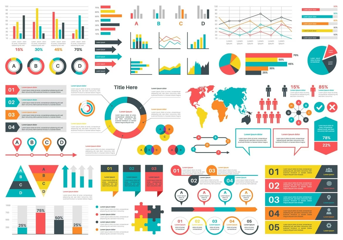
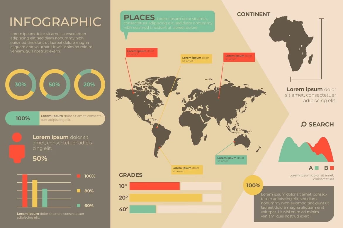
Statistical Infographics
Statistical infographics are built around numbers. They help show research results, growth dynamics, comparisons, or ratings. Instead of a table or spreadsheet, the audience sees visual diagrams, graphs, or figures that speak for themselves. Brands use this format in reports, press releases, and blog posts to make dry facts easier to digest.
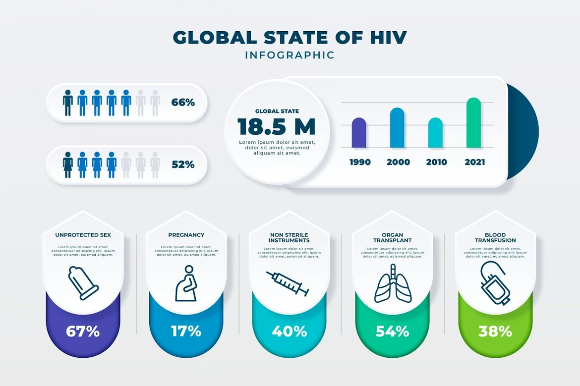
Source: Freepik
Process Infographics
This type visualizes a sequence of steps. It could be a guide to using a product, onboarding a new user, or explaining how a neural network works. Arrows, icons, and short labels help build a clear story. Good process infographics show the logic behind the actions and reduce friction for the user.
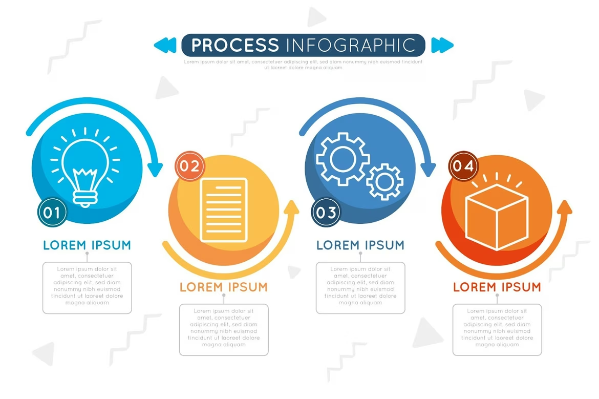
Source: Freepik
Timeline Infographics
Timeline infographics show how something changes over time. That might be the history of a brand, product evolution, or stages of a marketing campaign. Years, milestones, and events are presented in a linear format to help the viewer track progress or understand context.
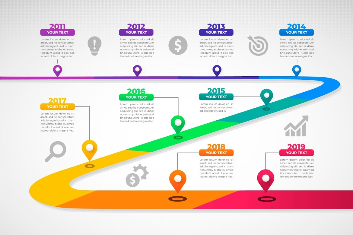
Source: Freepik
Geographic Infographics
This format is used when data relates to location. Maps with color coding, markers, or proportions help show trends by region, countries, or cities. It’s useful for market analysis, logistics, or event coverage.
Source: Freepik
Hierarchical Infographics
Hierarchy is about structure. These infographics show relationships: who reports to whom, how elements are organized, or what’s at the top of the system. You might see a pyramid of needs, a mind map, or a layered diagram. Brands use this to explain strategy, team composition, or product architecture.
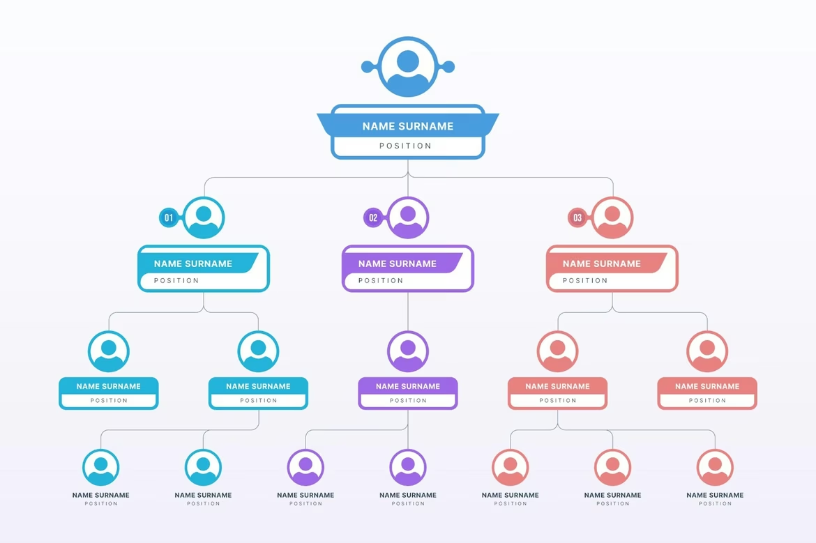
Source: Freepik
Comparative Infographics
Comparison works when you want to show differences or advantages. Infographics like this show two or more options side by side — features, performance, prices. It’s used in product pages, presentations, and sales materials to highlight strengths.
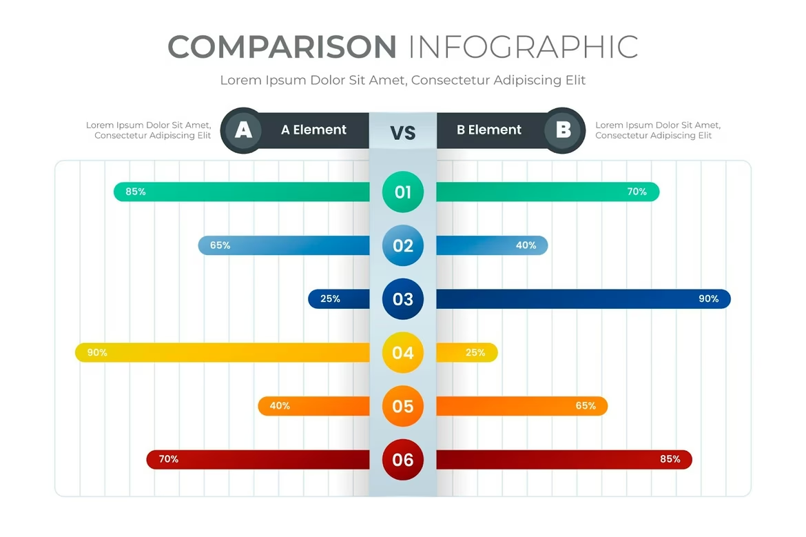
Source: Freepik
List Infographics
Sometimes you need to present a set of facts, ideas, or tips — but don’t want them lost in text. Infographic lists group items in visual blocks, often with icons or colors to support quick scanning. This format is common in blog posts and social media.
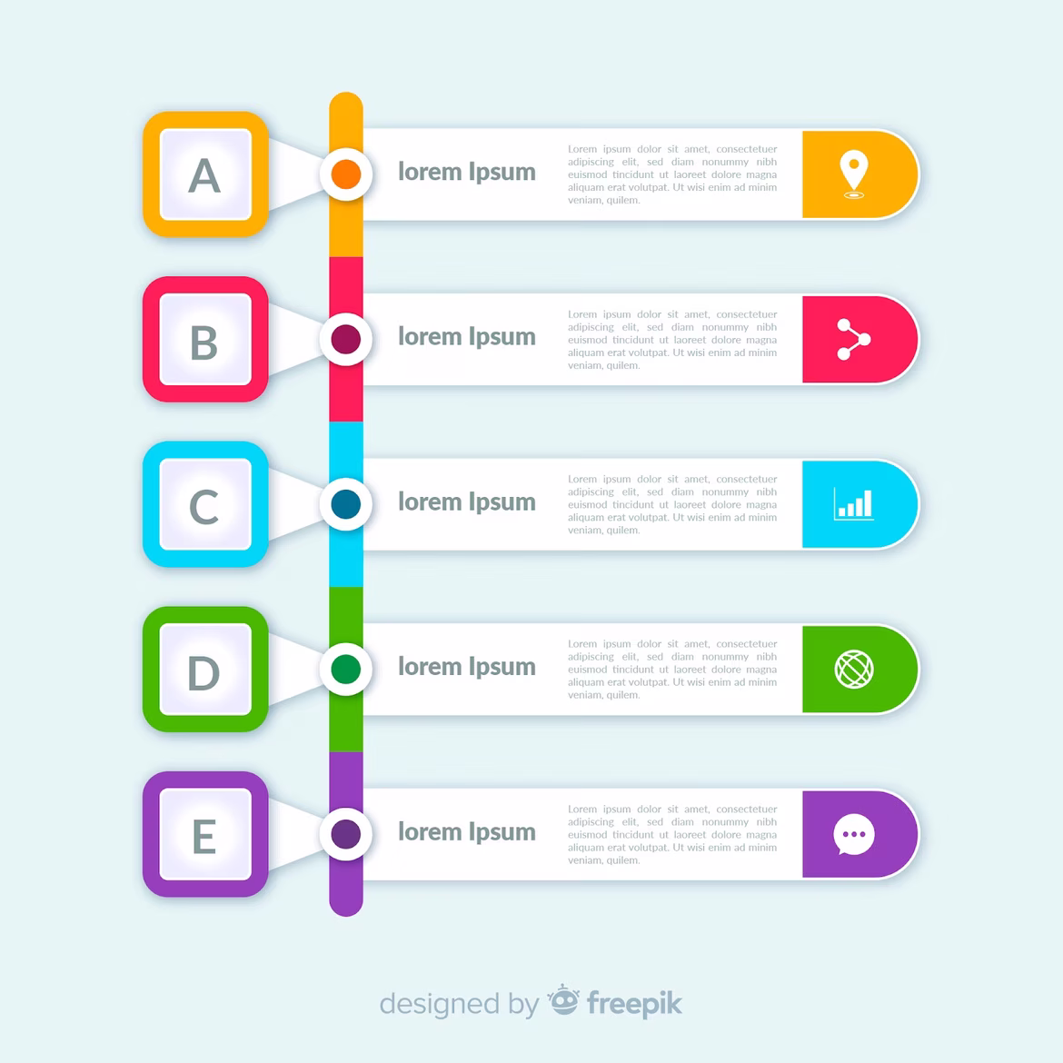
Source: Freepik
Why Infographics Matter in Branding and Marketing
For a brand, infographics are more than visuals. They build style, clarity, and trust. When a company uses a consistent graphic language, it becomes part of its identity — just like a logo or tone of voice.
A well-made infographic increases recognition. If the style is unique, people begin to associate it with the brand. It also strengthens expertise: by showing data clearly, a brand signals it knows its subject.
Infographics also grab attention. Visuals are processed faster and remembered longer. That’s why they boost engagement. Posts with infographics often get more shares and clicks.
In marketing, infographics work in multiple formats — from lead magnets and landing pages to email newsletters and pitch decks. They show benefits, simplify offers, and convince the audience to act.
How to Make an Effective Infographic
The first rule is clarity. An infographic should be easy to understand. If there’s too much text or chaotic design, the message gets lost. That’s why designers focus on simplicity, contrast, and visual hierarchy.
The data must be fresh and reliable. An outdated statistic or broken link ruins trust. The content should match the audience — in tone, color, and content. An infographic for a bank and one for a children’s brand won’t look the same.
Visual hierarchy helps guide the eye. What should be noticed first? What’s the key point? Colors, size, and positioning answer those questions. Everything should follow a logical path — from title to conclusion.
Branding matters too. Use brand fonts, colors, and logos. This ensures consistency and makes the content instantly recognizable.
Neural Networks and Infographics
AI now helps automate parts of infographic creation. You can feed data into a service — and get a ready chart. Some tools turn text prompts into layouts. Others suggest icons or color palettes.
Neural networks help find the right structure, analyze readability, or generate illustrations. That’s useful when there’s not enough time or budget for manual design.
While AI doesn’t replace creativity, it speeds up the routine and gives more time to focus on the message.
Trends in Infographic Design for 2025
Today, infographics are becoming more interactive. Instead of static images, brands use scrollable content, animation, or hover effects. These elements make the experience deeper and more memorable.
Minimalism stays strong. Clean design, simple lines, and restrained colors dominate. But 3D visuals and bold typography are gaining ground — especially in tech and innovation sectors.
There’s also a shift toward personalization. Infographics adjust to the user’s role, region, or past behavior. Data tells stories — and stories connect.
The main trend is storytelling through numbers. Infographics are no longer just data maps. They’re narratives. And when well done, they inspire action.
Infographics Are More Than Pictures — They Are Conversations
When Max showed that first infographic, something changed. He no longer had to explain everything — the visuals did half the work. Meetings became shorter. Decisions came faster. People finally understood.
Infographics aren’t just illustrations. They’re part of how brands speak. In reports, ads, or presentations — whenever information meets audience — infographics help the message land.
And the best part? Anyone can use them. With the right idea and a bit of structure, data turns into clarity. And clarity builds connection. That’s why infographics matter.
 Positioning
  Iteration
  Color Wheel