Golden Ratio


When designer Anna first started working with visual identity, she couldn’t understand why some layouts instantly felt "right," while others looked awkward—even when perfectly aligned to the grid. One day, she reworked a soap packaging design by shifting the logo and text just a few millimeters. The client exclaimed: "Now it’s perfect!" Later, she discovered that the new composition almost perfectly aligned with the Golden Ratio spiral.
That’s when Anna realized: perfect visual harmony isn’t always about taste. Sometimes, it’s pure math. Ancient math, in fact—dating back to Phidias and Leonardo da Vinci.
What Is the Golden Ratio, in Simple Terms
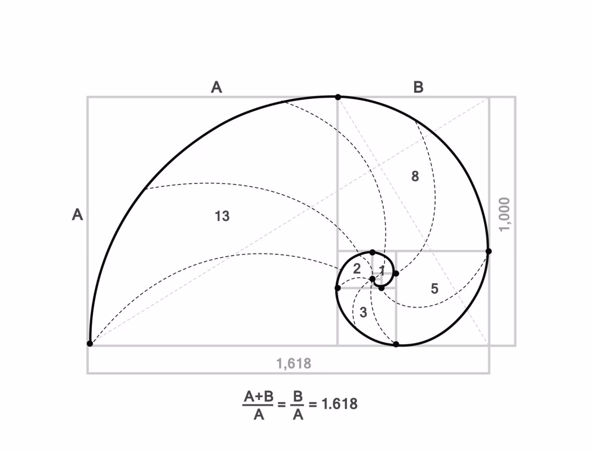
The Golden Ratio is a mathematical proportion found in nature, architecture, painting, and, of course, design. In short, its formula is: a relates to b as the sum of a + b relates to a. Or in numbers: approximately 1.618.
Source: Google Images
Complicated? A bit. But we can simplify.
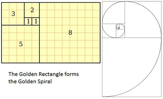
Imagine a rectangle. If its sides relate as 1 to 1.618, it’s a "golden" rectangle. Now divide it into squares, decreasing in size. If you connect the corners of these squares with a smooth line, you’ll get the famous Golden Spiral. Our eyes seem to "recognize" it—they follow it effortlessly. That’s why such compositions feel balanced, pleasing, and aesthetically satisfying.
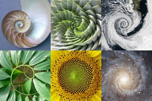
Nature loves math too: a snail shell, sunflower seeds, even the twist of DNA—all of these reflect the Golden Ratio. Humans simply borrowed this principle from nature and applied it: from the Parthenon to the Apple logo.
Source: Google Images
History and Cultural Context
The idea of a perfect proportion dates back to antiquity. The ancient Greeks knew and used the Golden Ratio. The Pythagoreans saw it as cosmic harmony, and Euclid gave it the first formal definition.
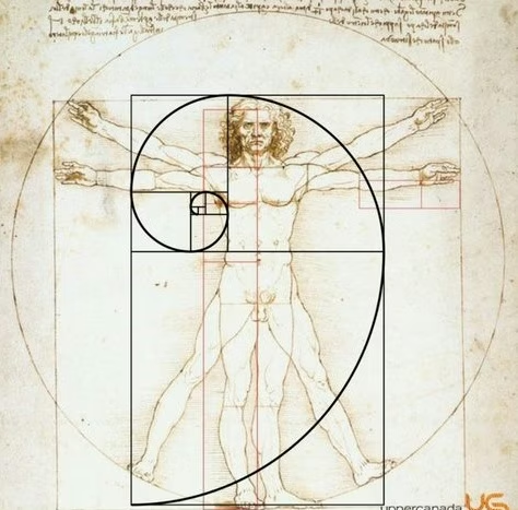
The Renaissance revived interest in the number ϕ. Leonardo da Vinci used it in his artwork and anatomical sketches, especially in "Vitruvian Man." In the 20th century, it became central to the study of typography, logo design, architecture, and even theories of visual perception.
Source: Art Studio "Bear Constellation"
Why the Golden Ratio Works in Design
1. Natural Aesthetics
The human eye is trained to recognize symmetry and proportion found in nature. That’s why designs built on the Golden Ratio look "right" to us.
2. Visual Focal Points
When you place key design elements along the Golden Ratio’s lines or intersections, it’s easier for viewers to absorb and retain information. This is especially useful in identity design, advertising, and web design.
3. Versatility
The Golden Ratio works across all formats—from business cards to packaging and landing pages. It helps create hierarchy, rhythm, and visual balance.
Source: Google Images
How to Use the Golden Ratio in Design
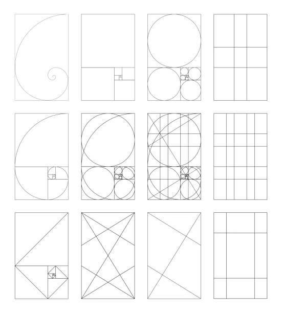
1. The Golden Rectangle
Create a rectangle with 1:1.618 proportions. Divide it into a square and a smaller rectangle, and repeat. This forms a spiral you can use as a layout foundation.
Source: Say Hi
2. Golden Grid
Swap the rule of thirds for a Golden Ratio grid. It helps you accurately place text, logos, images, and visual accents.
Source: Pinterest
3. Typography
Choosing font sizes for headings, subheadings, and body text based on ϕ creates a visual hierarchy without additional tricks.
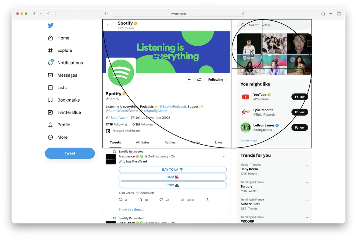
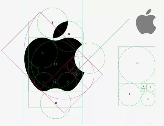
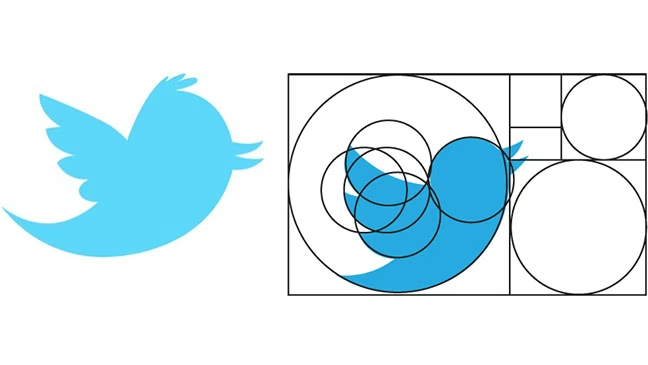
4. Logo Design
Logos based on golden proportions appear more refined and professional. Examples include the Apple logo, Twitter’s old logo, and National Geographic.
Source: Google Images
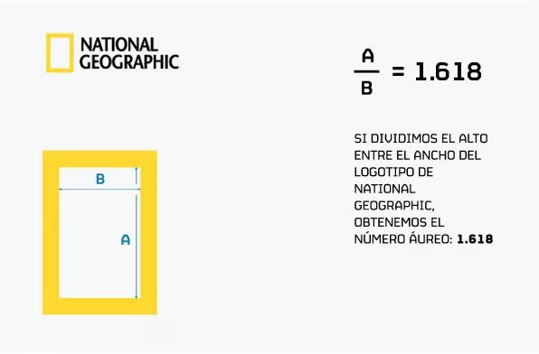
Source: Pinterest
The Golden Ratio and Brand Identity
In branding, the Golden Ratio is more than a design trick—it expresses balance, stability, and premium quality. Brands use it for:
- building logos and visual graphics;
- setting font sizes and spacing in guidelines;
- designing packaging that holds the viewer’s eye;
- creating visual rhythm in presentations and websites.
It’s especially relevant for brands in art, tech, education, and luxury niches.
A Word of Caution: The Golden Ratio Isn’t a Cure-All
The Golden Ratio is a tool, not a rule. It’s not always appropriate to squeeze every layout into a single proportion. If your brand thrives on tension, aggression, or boldness, the calm harmony of ϕ could backfire. The key is intentionality.
When to use it:
- to create strong, balanced visuals;
- when premium feel is essential;
- in projects focused on aesthetics.
When to think twice:
- for provocative or edgy design;
- if spontaneity or "noise" is needed;
- in adaptive interfaces with dynamic geometry.
Why the Golden Ratio Works Psychologically
Some say the Golden Ratio is intuitively pleasing—a universal beauty code inherited from nature. While that’s debatable, psychological studies do confirm: people perceive the Golden Ratio as "natural." That deeply affects decision-making.
In branding, this matters. People rarely analyze logos or layouts rationally. They just feel: "like it or not." If your visual is built on harmonious principles, it reads faster, sticks longer, and builds more trust.
Emotional Credibility
Imagine you’re a brand manager launching a new product. You want customers to feel confidence, reliability, style. If your logo or packaging looks "off" or chaotic, the brain will pick up on it—even if no one can explain why. But a layout built on solid structure? The brain says, "Okay. This brand knows what it’s doing."
Conclusion
Since then, Anna has looked at layouts differently. Golden rectangles and spirals started appearing in her Figma files—first as visual guides, then as real working tools. Sometimes everything clicked intuitively. Sometimes she consciously aligned elements to the invisible grid of beauty.
And every time a client said, "There’s something about this," Anna knew exactly what it was. That "something" was encoded in the proportion 1.618.
The Golden Ratio doesn’t replace taste, intuition, or experience. But it offers structure—like a metronome for musicians or perspective rules for artists. Even if used loosely, as a reference point, it makes design cleaner, more confident, more harmonious.
Having understood this, Anna no longer hesitated when guiding her teammates: "Try nudging it right a bit. No, a little more... There! Now it’s perfect."
 Color Wheel
  Branding
  Mascot