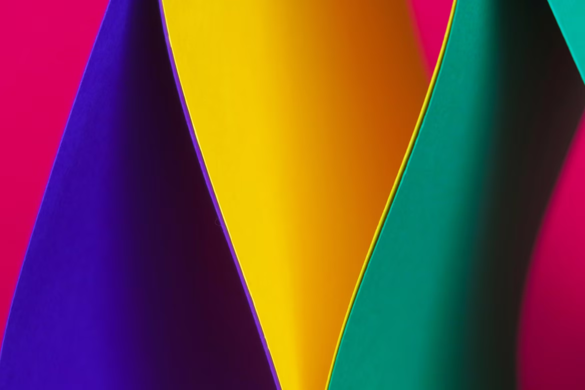
Contrast

The branding team gathers: designers talk about fonts and colors, marketers about emotions and values, and executives about business goals. Amid this storm of ideas, one of the most powerful visual tools is often overlooked — contrast. It can turn a bland presentation into a bold statement and a logo into a memorable symbol. For brand marketers, contrast isn’t about what looks good — it’s about what’s clear, memorable, and high-converting. This article isn’t just for designers — it’s for anyone building a brand who wants the visual identity to speak to the audience in a compelling and understandable way.
What Is Contrast: Definition and Role
Contrast in design is the difference between visual elements like colors, shapes, sizes, textures, and directions. It helps draw attention, emphasize what’s important, enhance legibility, and create structure. In branding, contrast is a tool to make communication clearer and more emotionally impactful. It doesn’t just improve aesthetics — it builds recognition and strengthens the message behind the visuals.
With contrast, designers guide the viewer’s eye, and brand managers shape perception. The more precisely contrast is applied, the stronger the message and the cleaner the visual hierarchy.
Types of Contrast
Color Contrast
Color contrast plays with light and dark, warm and cool, saturated and muted tones. It helps highlight key elements — from a website button to a brand name.
Consider Spotify’s use of bright green on a black background — a combination that grabs attention and enhances recognition. Another example is Slack, which uses a bold palette of complementary colors to create an energetic, tech-forward feel that immediately sets it apart.

Source: Branding Forum

Source: Salesforce
Size Contrast
Large elements naturally draw attention. Playing with scale creates rhythm and emphasizes hierarchy. It’s especially useful in packaging and outdoor advertising.
In Apple's advertising, bold headlines in large fonts contrast with fine print to prioritize key messaging.
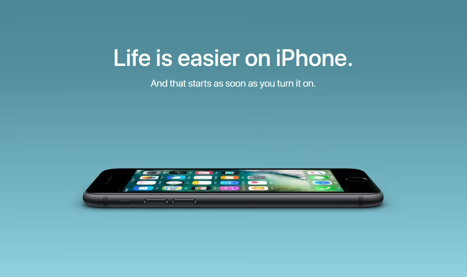
Source: Apple Insider
Shape Contrast
Geometric versus organic, straight versus curved — shape contrast adds visual interest. Many logos combine sharp and soft lines to balance seriousness with friendliness.
Look at the Airbnb logo: its simple, rounded shape contrasts with the sharp edges of its typography, signaling both warmth and structure. The Nike logo uses a single sweeping curve — a visual outlier in many layouts that draws instant focus.

Source: Wikipedia
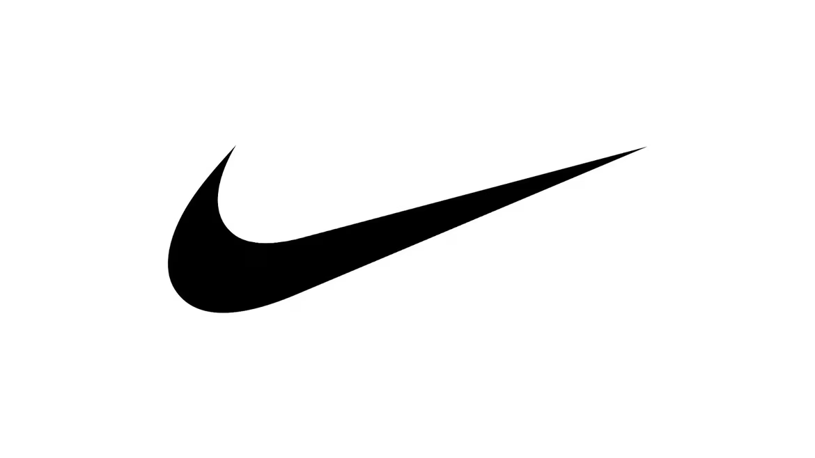
Source: Nike
Texture Contrast
Smooth vs. rough, matte vs. glossy — texture contrast isn't just for print. It shapes digital experiences too, making them feel tactile even on screens.
On the Adobe Creative Cloud site, gradients, glassy effects, and layered textures create depth, helping users distinguish interactive elements from background visuals. Figma also subtly uses shadows and layering to guide users through the interface.
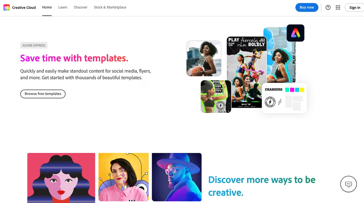
Source: CreativeCloud
Typographic Contrast
Different typefaces, weights, and sizes help structure text and express tone. This is key in brand communication, where copy must be both readable and distinctive.
Dropbox uses bold sans-serif fonts for headlines and lighter fonts for body text, ensuring readability while maintaining a tech-savvy aesthetic. Mailchimp employs playful, expressive typography in headlines that contrast with functional body text — reinforcing its friendly, creative brand voice.
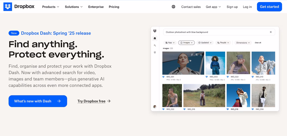
Source: Dropbox

Source: Mailchimp
Directional Contrast
Diagonal lines are more dynamic than vertical or horizontal ones. Direction sets movement and flow in a design.
Asana’s interface uses slanted elements in progress bars and banners to suggest forward motion and productivity.
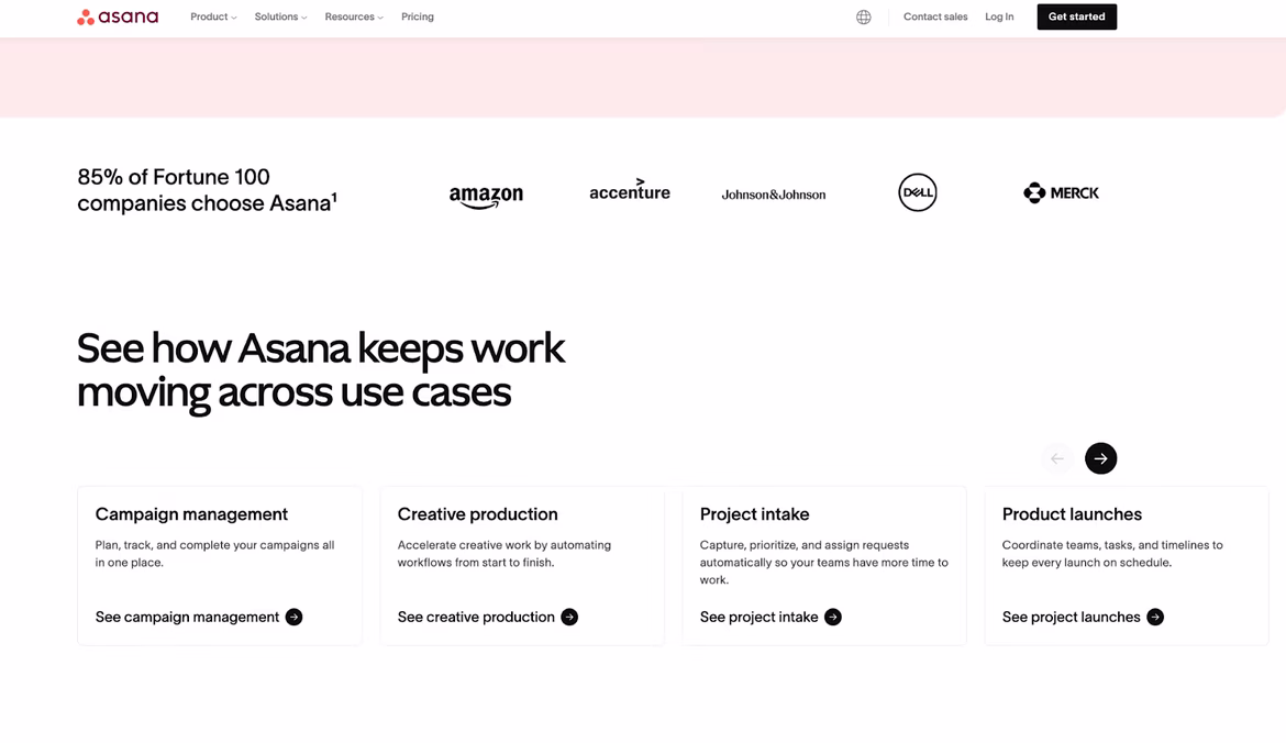
Source: Asana
Spatial Contrast
White space isn’t emptiness — it gives design room to breathe. Juxtaposing dense content with empty space improves readability and focus.
Apple’s website is famous for its use of white space, which elevates the product and simplifies the user experience. Stripe’s layout also balances complex data visuals with generous spacing, making technical content approachable.
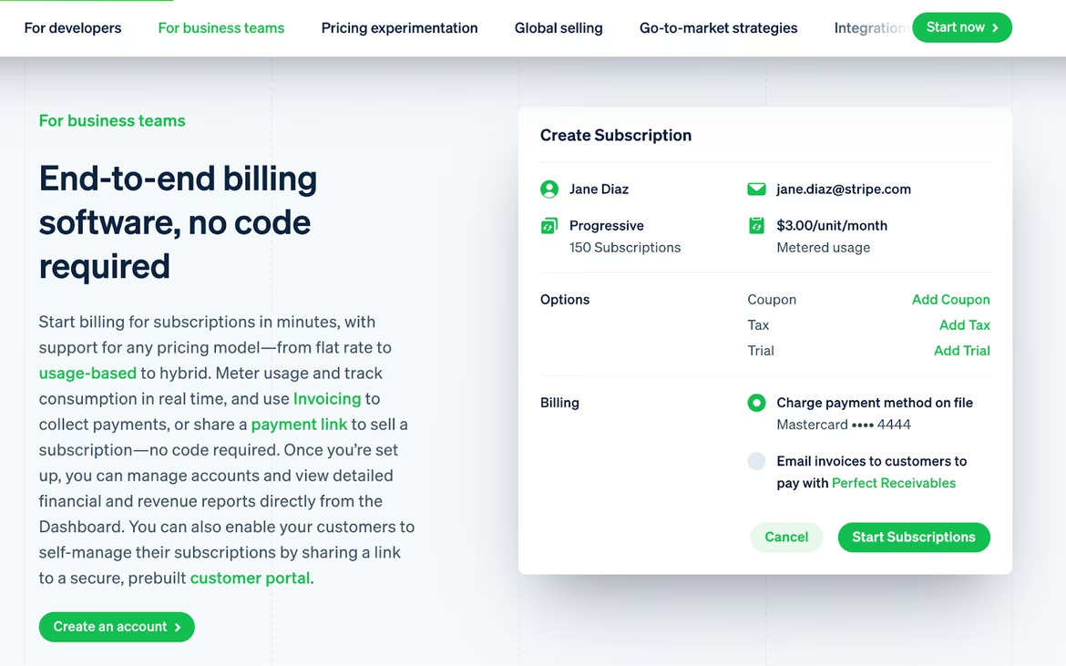
Source: Stripe
Why Contrast Matters in Branding
Contrast helps establish visual hierarchy, ensuring key elements stand out — critical in everything from landing pages to product packaging. Well-executed contrast enhances legibility, especially on mobile or in out-of-home formats where users have seconds to take in information.
It also shapes brand personality. Bold contrasts can signal confidence and innovation, while subtle ones imply sophistication and luxury.
Used strategically, contrast makes brands more visually unique. It helps them occupy a distinct place in the customer’s mind, visually differentiate from competitors, and build recall.
Using Contrast Wisely
Too much contrast causes chaos. Not enough, and the design fades into the background. Knowing where to go bold and where to stay subtle is key.
Contrast should serve the brand’s goals. A tech company might benefit from sharp color or typography contrasts. A wellness brand might use soft, harmonious contrasts to convey calm and care.
Contrast works best when balanced with harmony. It adds energy, but harmony keeps it readable and pleasant. Together, they create dynamic, comfortable design.
Neural Networks and Contrast: Smarter Design
AI can now analyze contrast levels in images and predict user response. Neural networks suggest color combinations, enhance layout hierarchy, and generate logo variations with different contrast profiles.
Modern tools also check for accessibility — ensuring sufficient contrast for users with visual impairments. This is crucial in digital design, where inclusivity is a core part of UX.
In the future, AI will adapt contrast in real time — adjusting brightness or saturation based on lighting conditions or device type.
In Conclusion
When a brand says “look here,” it uses contrast. When it wants to stand out in the noise, it turns to contrast again. This technique is simple but powerful, requiring both strategic thinking and creative finesse. For designers, it’s a tool. For marketers, it’s leverage. For brands, it’s how they speak.
Contrast isn’t just aesthetic — it’s structural, functional, memorable. The more deliberately it’s used, the stronger the brand image becomes. With the rise of smart tools like neural networks, contrast becomes an even sharper instrument. Which means now is the time to master its language — fluently, confidently, and purposefully.
 Positioning
 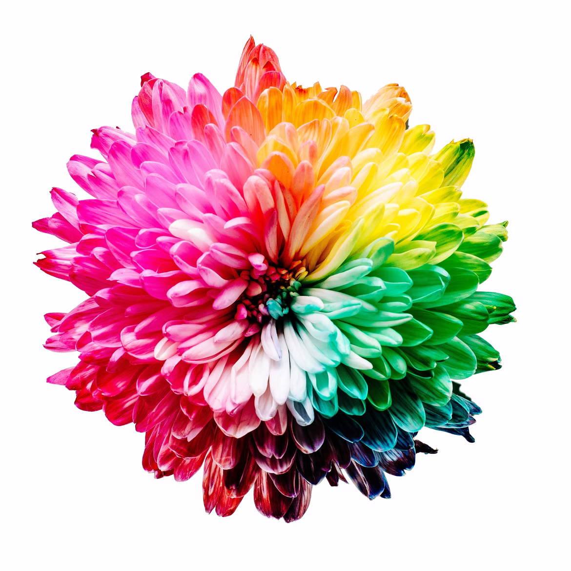 Color Wheel
 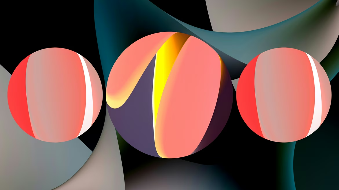 Branding