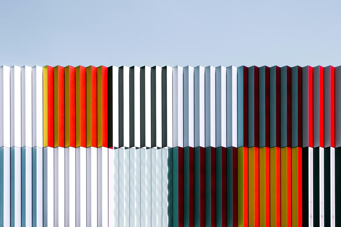
Composition

When Sarah opened her first café in Austin, Texas, she had a logo scribbled on a napkin and a website built overnight with a drag-and-drop builder. She printed the first flyer at a local copy shop. The result? Chaos. Images clashed with text, headings competed with subheadings, and the background seemed completely disconnected. People couldn't tell what kind of café it was, where it was located, or why they should visit. Later, when a designer offered to “tweak the composition a bit,” Sarah politely agreed — and then couldn't take her eyes off the result. The new flyer looked cleaner, brighter, and more convincing. Composition — that invisible, crucial force — made all the difference.
What Is Composition in Design
Composition is the arrangement of design elements into a unified visual whole. Fonts, images, colors, icons, spacing, layout blocks, backgrounds — they shouldn’t just coexist, they should work together. The goal is to create balance, harmony, and clarity.
Good composition makes your message understandable, enhances visual perception, and helps your brand feel confident and professional. When everything is in its place, the brain doesn’t struggle — it absorbs, remembers, and engages.
Key Principles of Composition
Balance
Balance means visual equilibrium — the idea that no part of the design overpowers another. It doesn’t necessarily mean mirroring elements (though symmetrical balance does just that). Asymmetrical balance uses contrast, color, scale, and positioning to create a sense of stability.
-
Symmetrical balance suggests order, formality, and professionalism. Think of banking websites or law firm brochures.
-
Asymmetrical balance feels more modern and expressive. It's common in tech, fashion, and lifestyle brands.
Good balance avoids clutter or confusion. A layout where everything feels “in the right place” is more likely to keep users engaged and reading.
Contrast
Contrast helps emphasize what's important. It works through opposites: light and dark, large and small, bold and neutral. Without contrast, design feels flat and dull.
Contrast creates hierarchy. It helps people know what to look at first. It’s achieved not just through color but through:
-
Size: Larger elements naturally draw more attention.
-
Weight: Bold vs. light typefaces.
-
Color: Light on dark or dark on light.
-
Shape: Round against square, organic beside geometric.
Strong contrast improves readability and accessibility. It separates sections, highlights actions (like buttons), and makes content skimmable — a must in today’s fast-scroll culture.
Example: Apple’s website is a masterclass in contrast. Bold headlines, thin subtext, sharp button colors — all structured for quick comprehension.
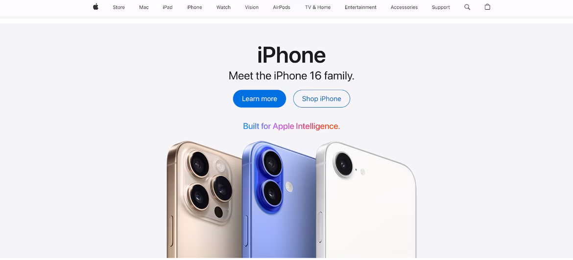
Source: Apple
E-commerce thrives on contrast. Amazon, for instance, uses bold product photos and price tags to draw instant attention.
Source: Amazon
Emphasis
Emphasis directs the viewer’s eye. A good focal point guides attention; a bad one distracts. Emphasis can be created not just with color but with shape, scale, or position.
Emphasis guides the eye to the most important part of the design. It can be a single focal point (like a product photo or CTA button) or a sequence of cues that tell the user where to look next.
Ways to create emphasis:
-
Isolation: Placing one item apart from others.
-
Position: Top-left, center, or “Z-path” in Western reading habits.
-
Color or brightness: Bright objects feel closer and demand more attention.
-
Motion or animation: Subtle movement can direct focus without being overwhelming.
Without emphasis, a layout becomes flat — the viewer may not know what to do or where to start.
Example: Ritter Sport packaging. The square shape is distinctive, enhanced with vibrant color and a large flavor label — turning store shelves into mini-billboards.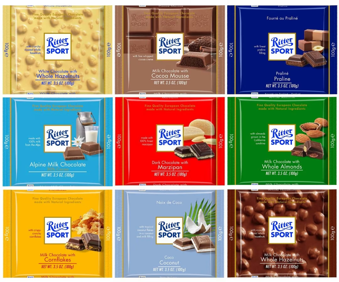
Source: Ubuy
Rhythm and Repetition
Rhythm arises from repeating elements, creating structure and predictability. Repetition makes navigation intuitive and reinforces brand consistency.
Rhythm is what makes a layout feel organized over time. Just like in music, repetition creates predictability — a sense of flow.
In design, repetition can involve:
-
Typography: Reusing heading styles and font weights.
-
Spacing: Keeping consistent padding and margins.
-
Layout blocks: Repeating grid patterns or card structures.
-
Colors and icons: Using brand elements systematically.
Rhythm helps with usability. If each section follows a clear and familiar pattern, users spend less energy figuring out how things work — and more time interacting.
In web design, rhythm shines on landing pages. Platforms like Miro repeat block structures (text – image – CTA) to make scanning effortless.
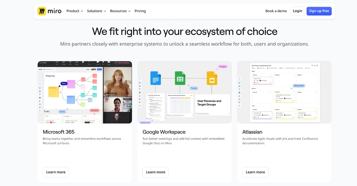
Source: Miro
Proportion and Scale
Proportion signals importance. Scale helps create hierarchy and focus. When everything is the same size, nothing stands out.
Proportion is about the relationship between elements — how big one item is compared to another. Scale determines visual hierarchy and reinforces importance.
For example:
-
Headlines vs. body text: Bigger fonts demand attention.
-
Images vs. captions: A large photo with a small label frames perception.
-
Buttons vs. surrounding content: Larger CTAs draw clicks.
Bad proportion can confuse — too many equally sized elements flatten hierarchy. Great proportion guides, prioritizes, and creates emotional impact.
UberEats uses oversized food images and CTA buttons in their app, contrasted with small labels — speeding up decision-making.
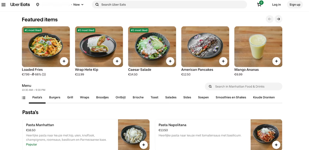
Source: UberEats
Unity and Cohesion
Unity means every element speaks the same visual language. Colors, shapes, spacing, visual metaphors — everything works toward one image.
Unity ties everything together. It means all elements feel like they belong in the same visual world.
-
Color palette: Should be limited and intentional.
-
Typography: Use a consistent set of fonts.
-
Grid and spacing: Uniform margins and alignments help structure.
-
Style: Images, icons, and illustrations should follow the same logic — flat, 3D, realistic, abstract?
When unity is missing, a design feels fragmented. When it’s present, viewers instantly recognize a brand, even before reading the logo.
Example: Slack’s interface. Icons, typography, and color palette align perfectly. Even their help center memes look “on-brand.”
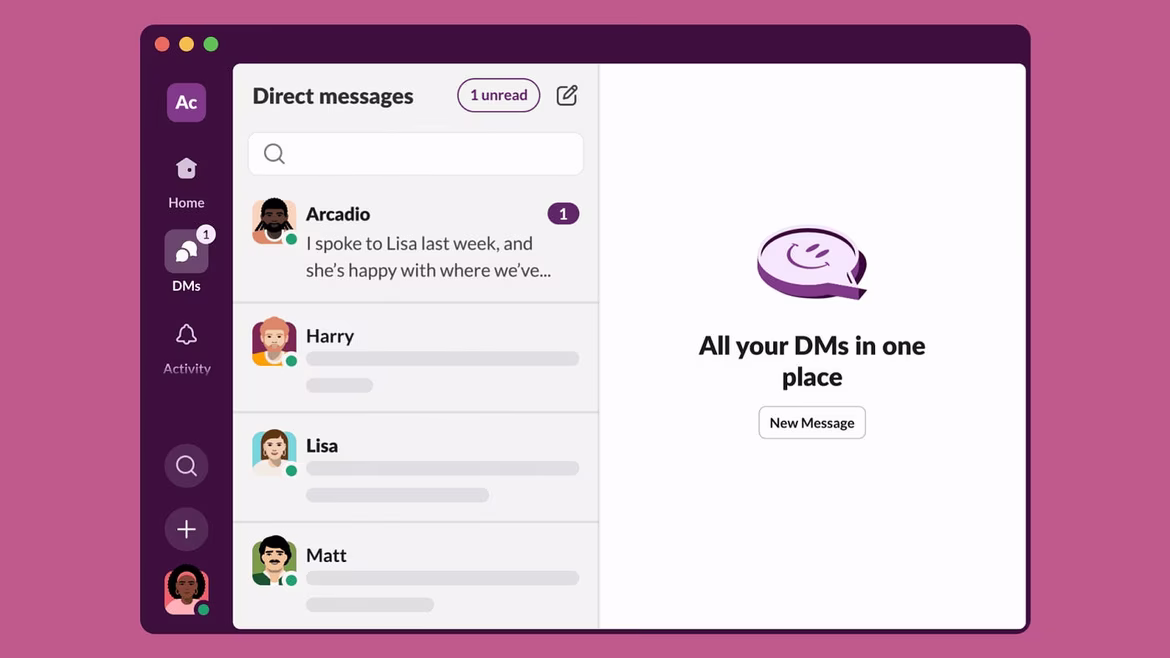
Source: Medium
Startups with strong culture-driven identities — like BetterUp — build cohesive systems across their site, product, and emails, boosting user trust.
Rule of Thirds & Golden Ratio
Borrowed from photography and fine art, these guidelines divide the screen into thirds horizontally and vertically. Placing key elements at intersections creates natural focus points.
These are classic composition principles from art and photography, used to create natural and pleasing layouts.
-
Rule of thirds: Divide the canvas into 3x3 parts. Place key elements near the intersections to create visual interest.
-
Golden ratio: A more mathematical approach (about 1:1.618) used for perfect proportioning of elements — from logos to web page grids.
These rules help avoid overly centered or “dead” layouts. They add movement and make designs feel more alive and engaging.
Types of Composition
Static (Symmetrical)
Conveys order and stability. Favored in premium markets: jewelry, luxury fashion, traditional banking.
Example: Tiffany & Co. website — centered layout, clean typography, well-aligned elements. It says: “We’re timeless, trustworthy, and upscale.”
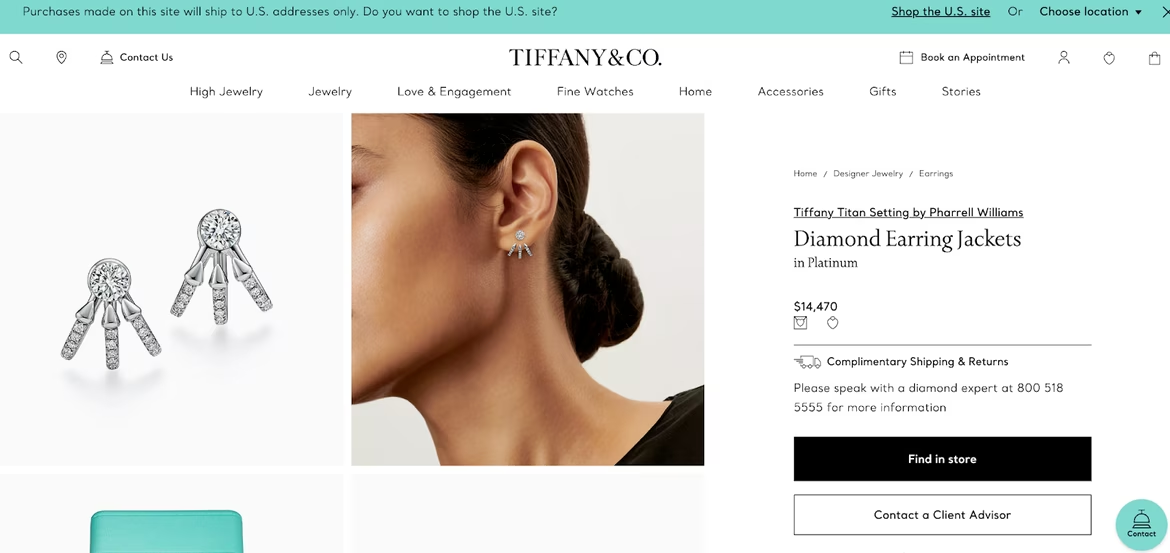
Source: Tiffany&Co
Dynamic (Asymmetrical)
Signals energy, freshness, spontaneity. Great for progressive, youth-oriented, or creative brands.
Example: Nike’s campaigns. Movement, asymmetry, powerful visuals — echoing the brand’s spirit of athletic motion.
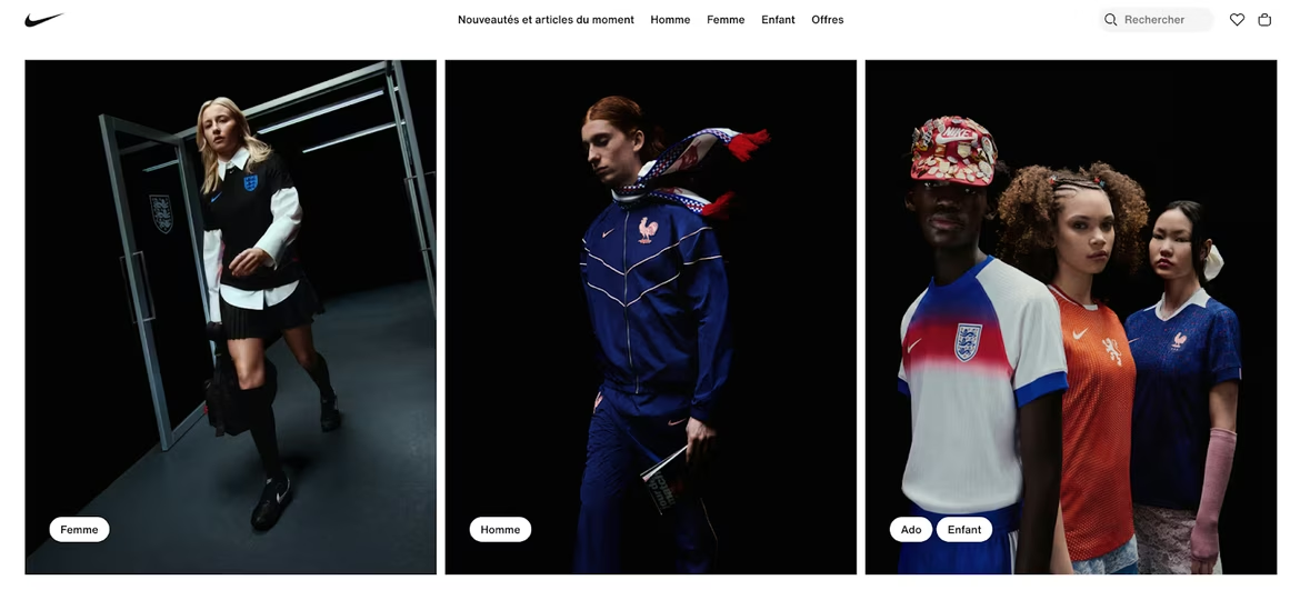
Source: Nike
Frontal
Puts the focus squarely on the main object. Often used in tech and auto promos.
Deep (Layered)
Creates a sense of space and atmosphere. Useful when storytelling is key.
Example: IKEA’s online catalogues use depth and layering — making viewers imagine themselves in the room.
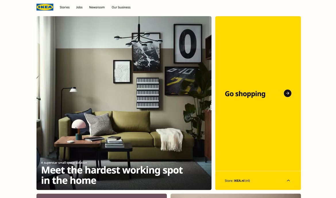
Source: IKEA
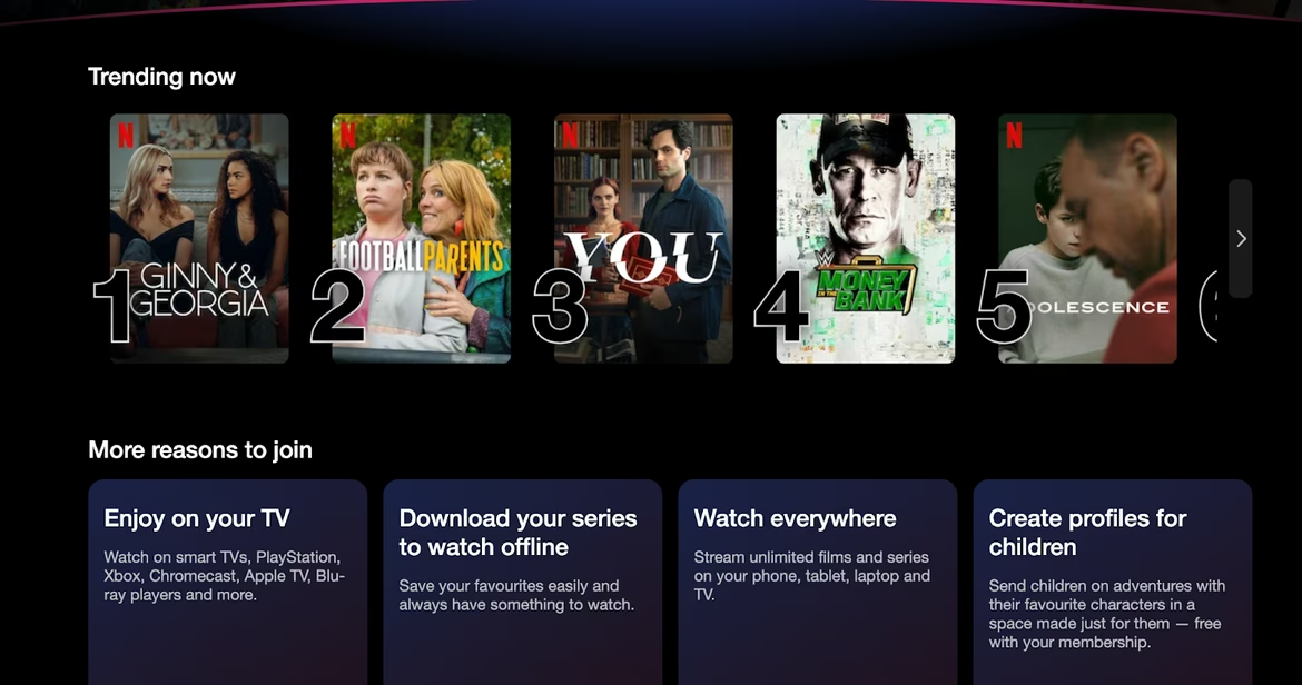
Open vs. Closed
Closed composition keeps everything within the frame. Open compositions let elements “bleed” out, suggesting continuation.
Example: Netflix’s homepage — film thumbnails spill off-screen, inviting scrolling.
Source: Netflix
Closed composition is common in traditional advertising. Think Mastercard banners — everything neatly contained.
Why Businesses Should Care About Composition
Composition isn’t just about making things “look good.” It affects how fast and clearly users grasp a brand’s message, values, and credibility.
Real-world examples:
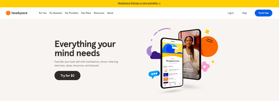
- Headspace: The meditation app uses soft colors, generous spacing, and centered layouts to evoke calm.
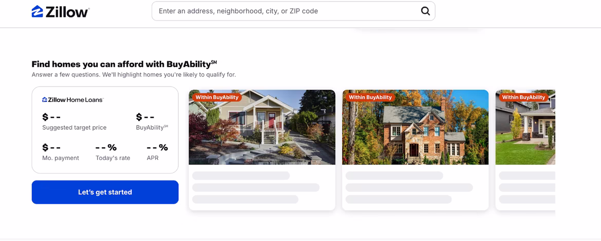
- Zillow: Real estate platform relying on proportion and contrast to avoid clutter and keep key info legible.
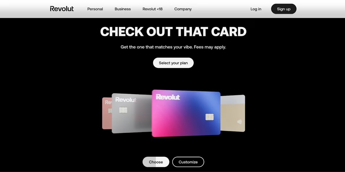
- Revolut: A neobank with dynamic layouts and visual emphasis driving attention and action.
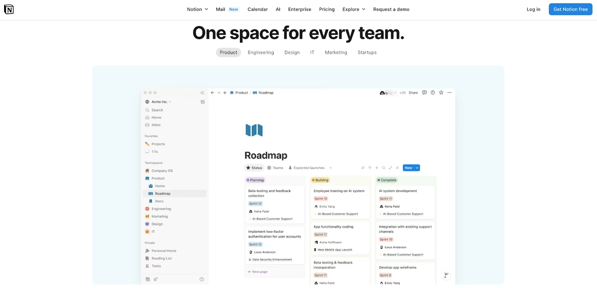
- Notion: A productivity tool with ultra-clean layouts and balanced white space, aiding focus and logic.
Brands that “get” composition look more professional and trustworthy — and are more likely to be remembered and convert.
AI and Composition
AI tools like Midjourney, Figma AI, and Adobe Firefly are now capable of:
- Suggesting composition variations
- Analyzing existing designs for balance and hierarchy
- Generating visuals aligned with compositional principles
- Adapting banners across formats without breaking structure
Examples:
- Canva’s AI suggests templates with built-in visual logic.
- Midjourney creates scenes with symmetry and rhythm.
- Figma AI recommends layout improvements in real-time.
However, no algorithm can replace human intuition. AI is a creative assistant, not the artist. A compositionally “correct” layout isn’t always emotionally right — and that’s where designers come in.
In the End
When Sarah fixed her flyer, she didn’t just make it prettier — she made it effective. That’s the power of composition. Whether you’re building a brand, designing a website, or printing a flyer, paying attention to how things are arranged can transform chaos into clarity — and intention into impact.
 Hype
Hype 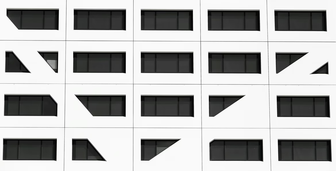 Target Audience
  Color Wheel