Branding


Andrey has been running a children’s sports club for a long time. Kids come to training with joy, win local competitions, but at city tournaments the team gets lost among dozens of others. The club’s posters blend in with neighboring ones, it’s hard for parents to find the schedule, and the kids complain: “Nobody recognizes us!”
One day before another tournament, Andrey hung a new poster. One of the children’s mothers frowned: “Where’s the training schedule?” — she pointed at the tiny text. The kids grumbled: “Too much stuff, it’s not clear what’s what!” Then Andrey realized: it’s not about the amount of information, but about how the club looks in people’s eyes, how it is perceived. For the first time, he thought about branding — about what makes a team recognizable and its values understandable.
What is Branding
A brand is perception. It is what people see, hear, and feel about the club. Branding is the process of creating this perception.
Going deeper into the concept of a brand
It is important to understand the difference between a product and a brand:
- A product is what you sell (in Andrey’s case — sports training for children)
- A brand is what people buy (a sense of belonging, pride in their child, trust in the coach)
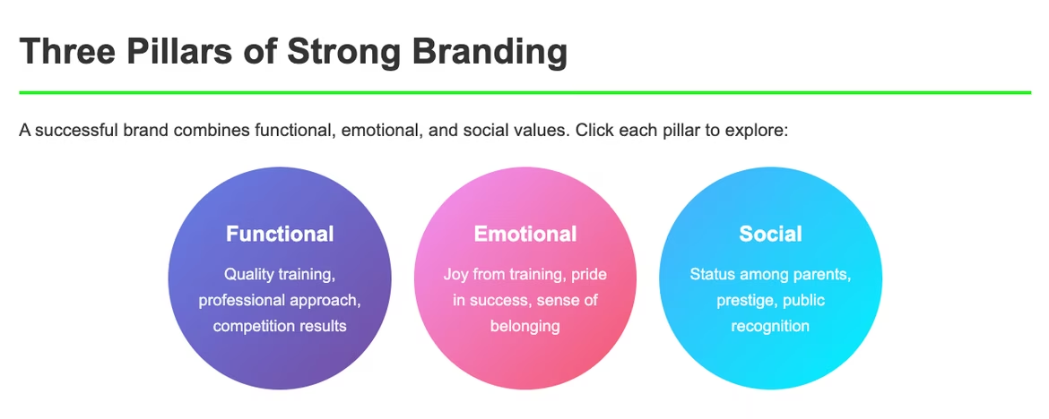
Components of a strong brand
The first component is functional value, which includes quality training, professional approach, and competition results.
The second is emotional value: children’s joy from training, parents’ pride in their child’s success, and a sense of belonging to the team.
The third component is social value, which is expressed in status among other parents, the prestige of participating in a well-known club, and public recognition of achievements.
For example, the well-known global brand McDonald’s. McDonald’s combines the function of fast food with the value of family happiness and childhood memories. Key elements include the golden arches, the red and yellow palette, and cheerful Ronald McDonald.
Thus, strong branding helps to:
- be recognizable among competitors
- build trust
- form a connection with the company
Stages of Creating a Brand
A step-by-step path from idea to recognition
Stage 1. Research and strategy
Before changing a logo or printing new posters, it’s important to understand what the brand is based on.
Andrey started with questions: who is his audience, how is his club different from dozens of others, what is really important for parents and children. Gradually, a brand platform emerged: clear values, mission, and a unique proposition.
Andrey came up with a short motto that the children were proud of, updated the schedule so that parents could easily find it, and on social media he began to talk not only about tournaments, but also about the club’s values — friendship, discipline, joy of movement.
Andrey conducted audience research:
- Surveyed current clients (parents and children)
- Surveyed potential clients
- Studied online reviews
Questions Andrey asked:
- What is most important when choosing a club for a child?
- What fears do you have when enrolling in a new section?
- How do you learn about sports clubs?
- What should an ideal club have?
For competitor analysis, Andrey:
- Created a table with similar organizations
- Assessed their strengths and weaknesses
- Found untapped niches
|
Competitor |
Strengths |
Weaknesses |
Opportunities |
|
“Champion” |
Professional coaches |
High prices, strict atmosphere |
Family approach |
|
“Start” |
Low prices |
Outdated equipment |
Modern methods |
|
“Olymp” |
Convenient location |
Little attention to each child |
Individual approach |
Stage 2. Creating identity
The next step is to make these values visible. This is where the visual language is born: logo, colors, fonts, elements of corporate style.
Instead of random pictures and colorful posters, the club received a unified style: clear fonts, bright but calm shades, a recognizable symbol. Even the children’s uniforms became part of the brand.
Logo
Andrey read about the principles of creating a good logo and defined that his logo should be:
- simple and memorable, recognizable in 3 seconds
- scalable: it should look equally good on a signboard, a business card, and a social media banner
- unique: different from competitors
Color palette
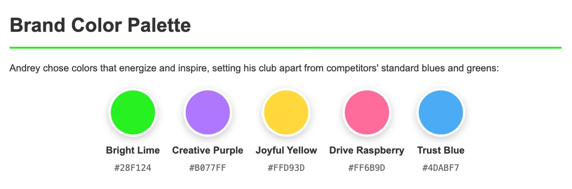
Andrey heard that a color palette is needed to better distance from competitors and create the right impression on clients. He used the free color palette generator by the neural network Ironov and got bright and accent colors that clearly stood out among competitors who chose standard green and blue tones.
- Main: bright lime (#28F124) — associated with energy, freshness, growth, and movement
- Additional: purple (#B0777) — about creativity and inspiration, balances the energetic lime, adding depth and seriousness so the brand looks not only fun but also thoughtful
- Several accents: yellow, raspberry, and blue — they make the brand lively and emotional: joy (yellow), drive (raspberry), trust (blue)
Typography
Andrey knew little about fonts and chose the most common — Sans Serif. He made it the main font and used it in headings; for body text, Sans Serif also worked well since it’s readable even in long texts, and as an accent font Andrey chose a handwritten style, thinking it would create a sense of warmth.
Now Andrey had all the necessary elements: logo, color palette, and fonts. With them, he was able to order new sports uniforms, decorate the gym in the new brand colors, make banners and social media covers in a unified style, print coach business cards, and even prepare branded bags and souvenirs for the kids.
Stage 3. Communication and implementation
Andrey understood that branding is not only about visuals. It’s about how the team speaks, how texts sound, what principles are built into the culture. He thought about how to talk about the club: the style of social media posts, slogans on posters, the tone of communication with parents. He made it consistent across all communication channels with children and parents, choosing a warm, friendly, but confident mentor’s tone.
Developing a communication strategy
From his own experience, Andrey noticed that he uses social networks in different moods and for different purposes. For example:
- with friends and colleagues he communicates more in Telegram
- in Facebook he watches videos and posts family photos
- in Instagram he checks short videos
So he decided that communication with clients also had its specifics. For example:
- Facebook: post photos from training and children’s achievements
- Telegram: use for quickly delivering information to parents
- Instagram: post events, reels, and stories
He created a content plan for a month in this ratio: 40% training process, 30% children’s achievements, 20% useful sports info, 10% entertainment. He also put up posters in schools and kindergartens, flyers at sports events, and banners in the sports hall.
Branding Strategies
Positioning
Andrey decided that the club would be recognizable as a team that teaches cooperation through sports. A unique place in the city where every child is valued.
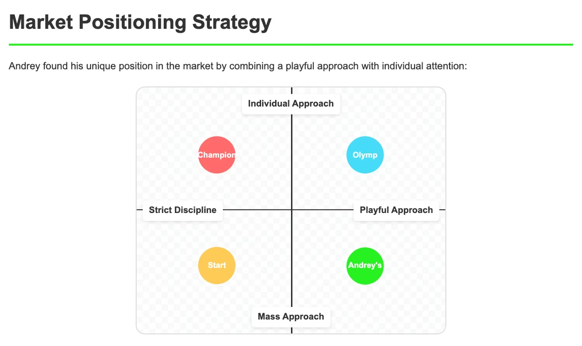
Positioning map
Competitors by axes:
- X-axis: from “Strict discipline” to “Playful approach”
- Y-axis: from “Mass approach” to “Individual approach”
Andrey’s club took the position: “Playful approach + Individual approach” — a free niche on the market.
Positioning strategies
- By advantage: “The only club where every child is a star of the team”
- By target audience: “For parents who want to develop leadership qualities in their child”
- By use: “Sports not for records, but for life”
- Against a competitor: “Not like in ordinary clubs — with us, everyone matters”
Brand expansion
Andrey got excited and already dreamed of opening not just one, but several sections in his city. When new groups for different ages appear, he wanted them to keep the same identity — colors, fonts, logo — so parents understood that it was part of one team. If the section was successful, he already knew his next step.
- Vertical expansion:
- Groups 4–6 years: “Little Champions”
- Groups 7–10 years: “Young Athletes”
- Groups 11–14 years: “Teen League”
- Horizontal expansion:
- Summer sports camps
- Family sports festivals
- Workshops for parents
Multibrand strategy
A year later the club grew so much that Andrey decided to open a football section. Then parents asked for gymnastics for girls. But how not to lose recognizability if the directions were different?
He came up with a clever move: he named everything “Andrey’s Sports Family,” and inside appeared “Football Academy,” “Gymnastics Studio,” and simply “General Training” for kids. The logo stayed the same, the colors too, but each direction got its own twist in design.
Parents quickly understood the system: if the older son goes to football, the younger daughter can safely go to gymnastics — the quality will be the same. Plus Andrey didn’t have to build the reputation of each section from scratch. And when printing flyers, he ordered for all directions at once — it came out cheaper.
The Role of Design and Neural Networks
Design helps the brand “speak” without words. Colors, fonts, shapes convey values and emotions.
Using neural networks in branding
Neural networks speed up work: they suggest logo options, posters, and certificates, taking trends and composition into account. Andrey chooses and adapts them for his audience — technology helps, but the person decides.
Practical tools for creating logos:
- Ironov.ai — professional, unique, non-template logos. The neural network also creates other identity elements — business cards, social media covers, slogans — all within minutes
- Canva AI — simple logo options
- Looka — template logos
Practical tools for evaluating a brand
Recognition metrics
Measuring recognition metrics helps understand whether branding works as intended. Without numbers and observations it’s easy to be deceived: it may seem that the logo or palette “stick by themselves,” but in reality the audience doesn’t distinguish them among dozens of others.
Quantitative indicators give an objective picture:
- if only a few recognize the logo without text, then the visual elements have not yet stuck in memory
- long reaction time in a speed test shows that the brand is not associated with a clear image
- low share of first mention among competitors signals a weak market position
Qualitative metrics allow deeper insight. Associations show which emotions and images people connect with the brand. Emotional connection reflects whether the club becomes “one of their own” for participants and parents. And readiness to recommend (NPS) is a direct indicator of whether the brand will grow through word of mouth.
Regular tracking of these metrics allows timely adjustments of visual and communication solutions. If numbers and associations differ from the intended image, that’s a signal: change details of identity, presentation, or strategy. As a result, measuring recognition turns branding from a subjective feeling into a managed process.
Monitoring tools
Brand monitoring is a way to understand how successfully a club or company has taken root in the audience’s mind. Without measurements, it is impossible to see the real picture: you can invest in advertising or design but not know if it works.
Online tools show how often the brand is mentioned online, whether it’s searched in search engines, and how people react on social media. This helps track popularity dynamics and engagement.
Offline methods provide live feedback: parents and children tell what they like and what causes confusion. This observation helps to timely adjust positioning and communication.
Online:
- Google Alerts — mentions on the internet
- Google Trends — search query frequency
- Social networks — reach and engagement
Offline:
- Surveys of parents at events
- Interviews with children after classes
- Observation of behavior at competitions
Common mistakes in branding
Copying competitors is a dead end. Instead of thinking “Let’s make a logo like the successful club nearby,” it’s worth finding your own unique style.
Overloading with elements kills memorability: a logo plus five colors plus three fonts plus many details create chaos, whereas simplicity is remembered forever.
Ignoring feedback shows up as the thinking “I like it, so everyone will like it,” but the right approach is to test every element on the target audience.
Inconsistency means one style on social media and a completely different one on posters, instead of unity across all brand touchpoints.
Conclusion
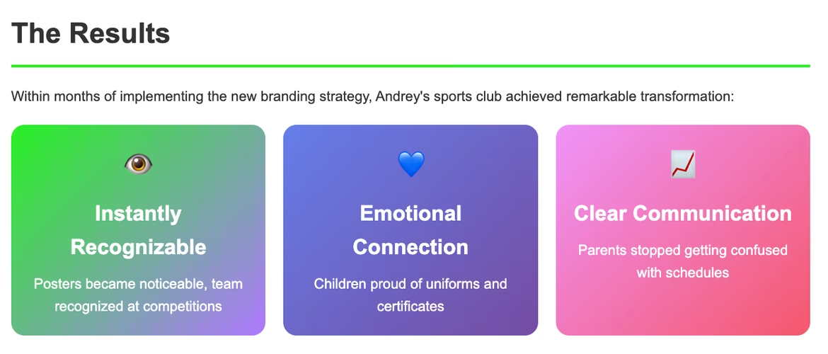
A few months after launching the new branding, Andrey’s club transformed. Posters became noticeable, parents stopped getting confused with the schedule, children were proud of their uniforms and certificates. At city competitions, the team was instantly recognized: “That’s them, with the bright identity!”
Branding is not just a beautiful logo. It is a system that forms perception, trust, and emotional connection. Even a small club can become a recognizable brand if values, visual image, and communication are well thought out. In a world where attention is scattered, strong branding helps remain visible, recognizable, and meaningful.
 Unique Value Proposition
  Brand Identity
  Descriptor